
I led many improvements of e-commerce web products while working at InsureMyTrip for nearly 8 years. I collaborated with other designers, web developers, stakeholders, business owners, senior management, marketing, customer service and regular customers to constantly improve user experience and visual design.
When arriving in the company I faced a website with outdated design, which the owner created himself, when starting the business in the 90's, which included: full-width layout, pixelated bitmap navigation images, cluttered content, missing clear space, long complicated forms and complex interactions. These were some of the characteristics for this and many websites from the early years of the Web. The site needed a serious facelift and because of its specific user demographics it had to happen slowly, year after year, tackling different usability challenges and content along the way.
With the following examples I'll try to present the 6-year timeline of the site's homepage.
2008
This edition of the site design is a simpler successor of its previous version and was finalized before my arrival at the company. Major changes here are moving from full-width to a centered layout as well as simplifying both side sections. Call-to-action(CTA) button was introduced to the right to improve quote conversions. In this version (shown below) I participated only as a front-end designer.

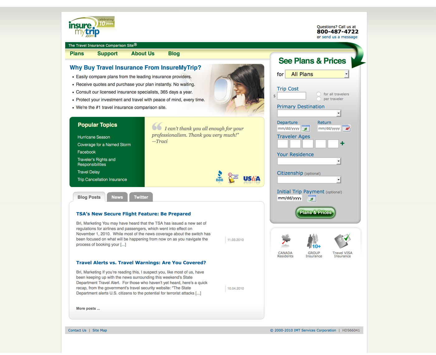
2010
After years of mostly technical back-end upgrades, the homepage received a new look. A need for additional relative homepage content required the layout to be updated. The raising of quote conversions was another important challenge. Introducing a simplified quote form to the homepage was the key. It saved many extra steps previously causing serious user abandonment during the quote-buy process. It also helped shorten the order time and improving conversions. The navigation fit into a single row, which opened more space for content below. Introducing a supportive photo in the main content area balanced the focus on the quote form and surrounded main content.
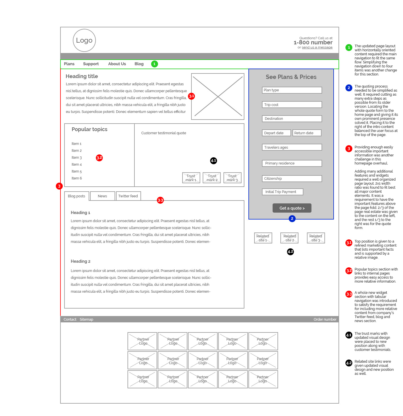
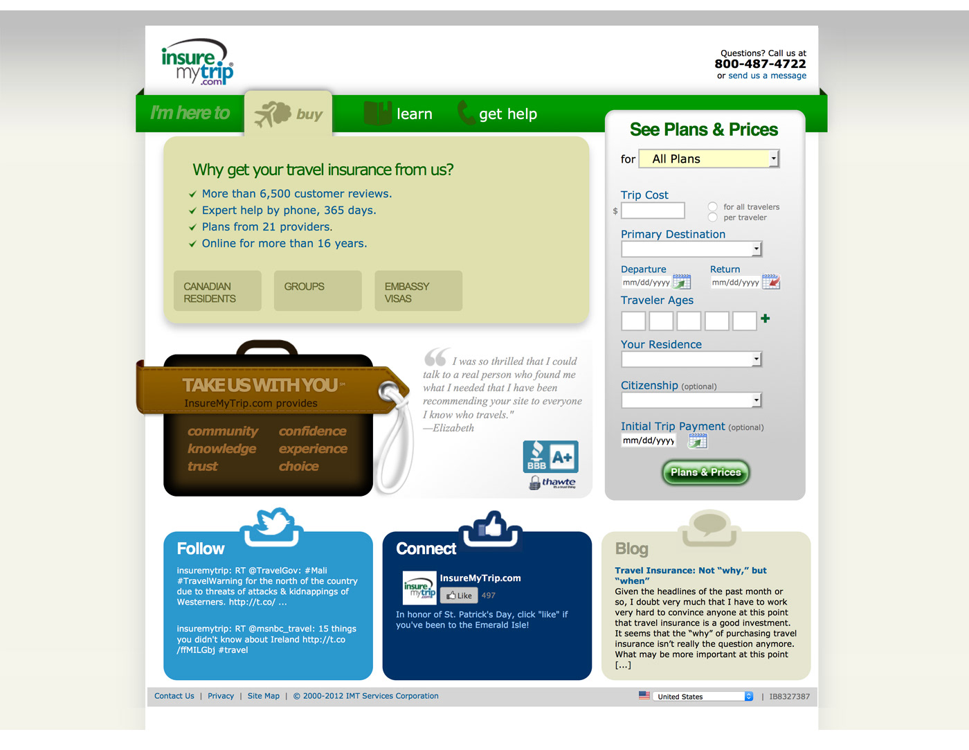
2012
Improving organic SEO required rethinking of the homepage content strategy and updating the layout architecture to fit more relevant content. Main navigation was simplified down to three items, where each one became a tab with unique content and sub-navigation. Quote form didn't change but social media widgets were redesigned. Visual design was slightly updated as well.
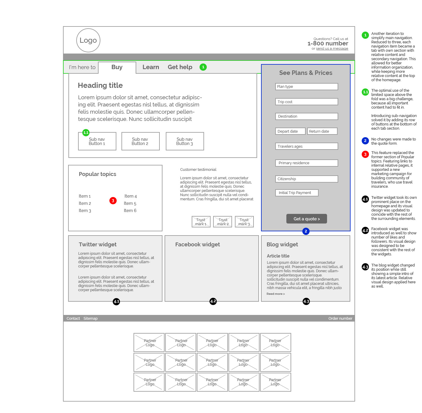
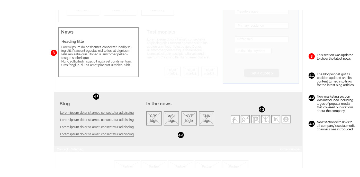
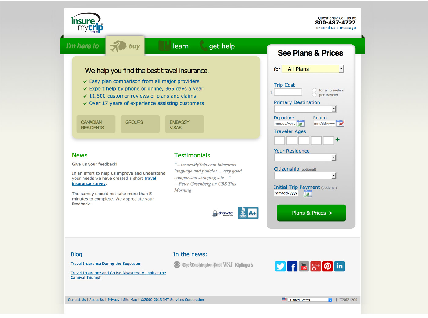
2013
Most of the page layout and visual design was kept unchanged. Only a few layout changes at the bottom were made to accommodate the rising impact of social media and more fresh content.
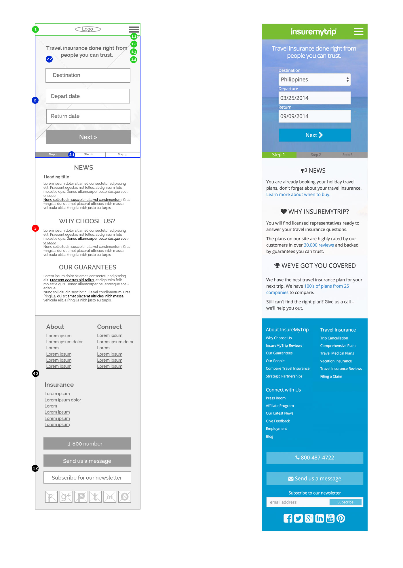
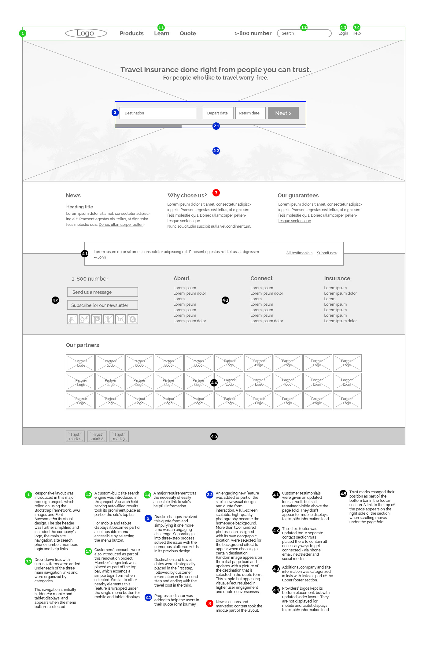
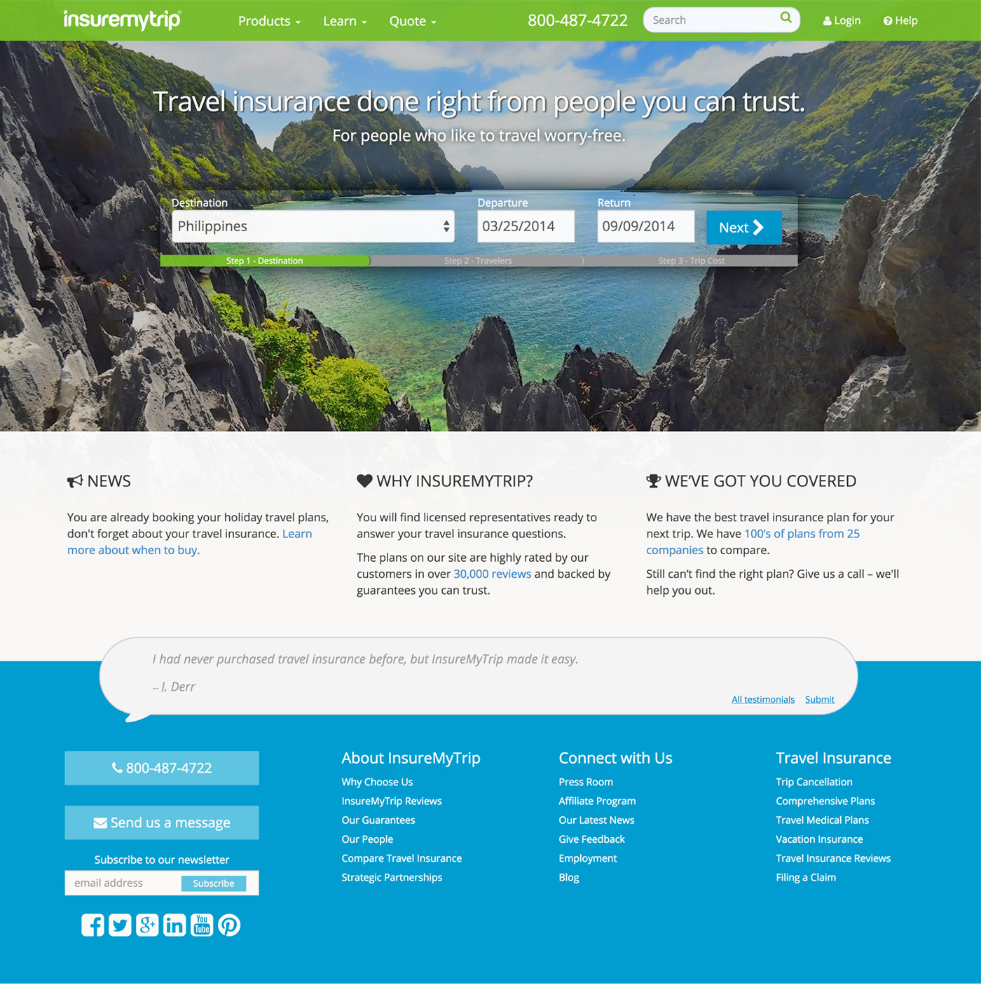
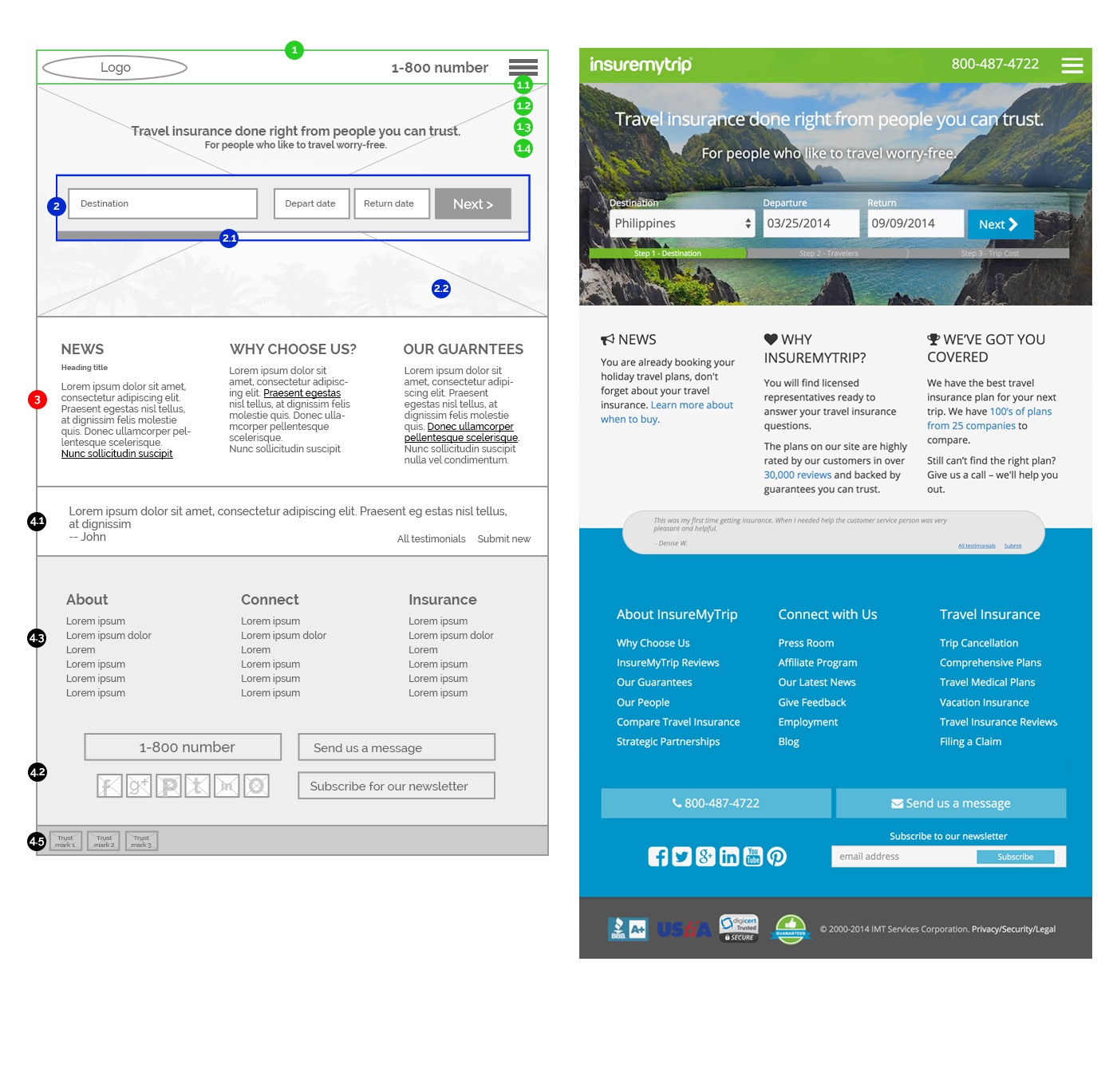
2014-Present
Responsive, mobile, fresher.
When I took the senior designer role at the company the first project I pushed for was the usability and visual redesign of the company's website. All started from the homepage, which older versions shown above were lacking major functionalities, modern visual appeal and most importantly responsiveness. Along with the newly updated company brand identity (done as a separate project), I led the redesign efforts for this design improvement project in collaboration with other designers, stakeholders, marketers and web developers.
It all resulted in modern visual and responsive site layout optimized for tablets and phone screens, simplified navigation and quote-buy process interaction, faster page loads with SVG graphics, custom search engine as well as custom-built administration CMS. All resulted in higher traffic improvement and 15% raise in conversions.
Tablet view
Mobile view