
Project Overview
• The Objective: Strategic redesign of novel acquisition tool measuring brand visibility across various AI platforms.
• The Challenge: Transforming complex AI sentiment data into an intuitive, action-oriented dashboard for marketers.
• My Role: Lead UX Designer; managed end-to-end strategy, information architecture, and conceptualization.
• Process: Partnered with engineering to define AI-assisted workflow to accelerate the design-to-code cycle by ~60% while customizing the UI where precision was critical.
• Key Impact: >2x increase of avg monthly qual leads; Reduced "Time-to-Insight" experience, converting data into an actionable AEO Insights Roadmap.
THE DEEP DIVE
AEO Grader: Designing for the Zero-Click Future
From concept to global scale, Mobile‑first, outcome‑driven product redesign for HubSpot's AI Answer Engine Optimization tool.
Role: Lead Product Designer (Sr UX Designer)
Company: Hubspot (2025)
Scope: Product Design, UX, Design Strategy, Mobile, AI, Acquisition Marketing
Partners: Marketing, Acquisition, Engineering, AI Solutions, QA, PM
Duration: 6 months
Company: Hubspot (2025)
Scope: Product Design, UX, Design Strategy, Mobile, AI, Acquisition Marketing
Partners: Marketing, Acquisition, Engineering, AI Solutions, QA, PM
Duration: 6 months

The Context
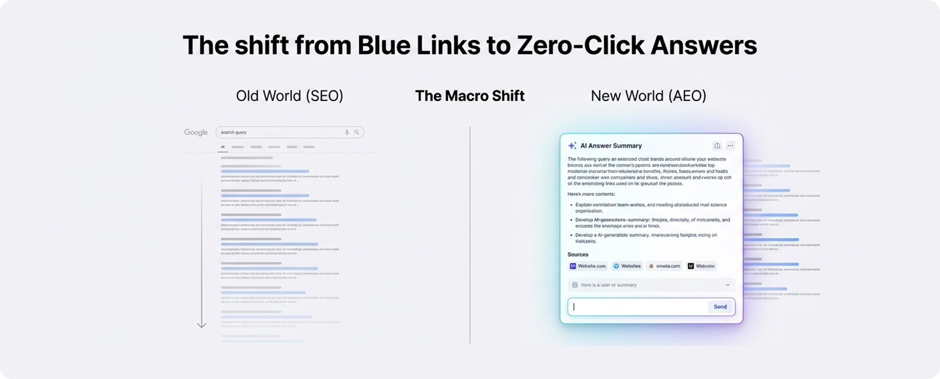
The Macro Shift
Users are no longer clicking links; they are reading Al summaries generated by LLMs.
The Risk
Brands are becoming invisible. If an Al doesn't cite you, you don't exist in the answer.
The Solution
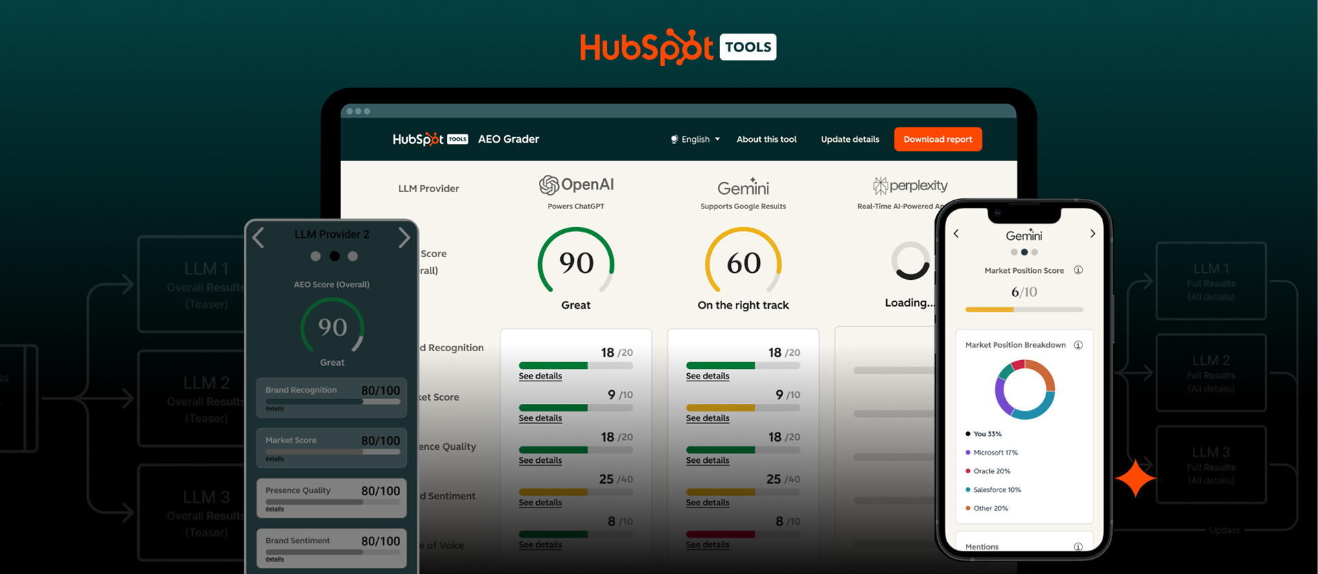
AEO (Answer Engine Optimization) is the new SEO. AEO Grader is Hubspot's micro app for AI answer visibility.
➜ It evaluates how LLM answer engines like ChatGPT, Perplexity, and Gemini interpret and represent a brand in AI-generated answers.
➜ Designed as the AI-era equivalent of website grader apps it targeting marketing and sales professionals.
What it delivers
It provides an overall assessment plus breakdowns that help teams understand visibility, sentiment, competitive positioning, and related signals (e.g., share of voice / citations), along with guidance on improving representation in AI results.
Why it matters
As AI search grows, brands need visibility inside answers, not only in traditional search rankings. AEO Grader helps benchmark and improve that “answer visibility.”
The Business Goal
Drive top-of-funnel demand via a free AI visibility tool and increase lead generation + trust
➜ Position HubSpot as a leader in AI-powered marketing.
➜ Create a scalable foundation for LMO/AEO products.
The User problem
Buyers increasingly rely on AI-generated answers instead of traditional search.
➜ Marketers lacked visibility into AI-synthesized brand narratives - Invisibility Anxiety: "Am I visible in Al?"
➜ Manual testing across LLMs was fragmented and non-actionable.
➜ Legacy solution lacked clarity, trust, and mobile usability.
The User goal
Understand their brand AI visibility gaps.
The Opportunity
Delayed time-to-value: Clarify AI results + increase conversion.
Role, Ownership and Scope
➜ Cross-functional lead designer embedded with MarTech AI engineering team, Data Analytics, Brand, QA and Design Ops.
➜ Owned end-to-end UX strategy: IA, flows, interaction design, mobile patterns, and experimentation.
➜ Partnered with FE/BE/QA through prompt consolidation and schema evolution.
➜ Aligned product owner + stakeholders through regular reviews and tradeoff decisions.
Constraints
High-stakes AI outputs
AI-generated assessments directly influence marketing and campaign decisions, raising the cost of misinterpretation.
Risk of over-trust in AI scoring
Users may treat scores as authoritative without understanding limitations, requiring careful framing and explanation.
System-aligned scoring & naming conventions
UX needed to adhere to predefined scoring models and terminology to ensure narrative consistency across providers and brand reporting.
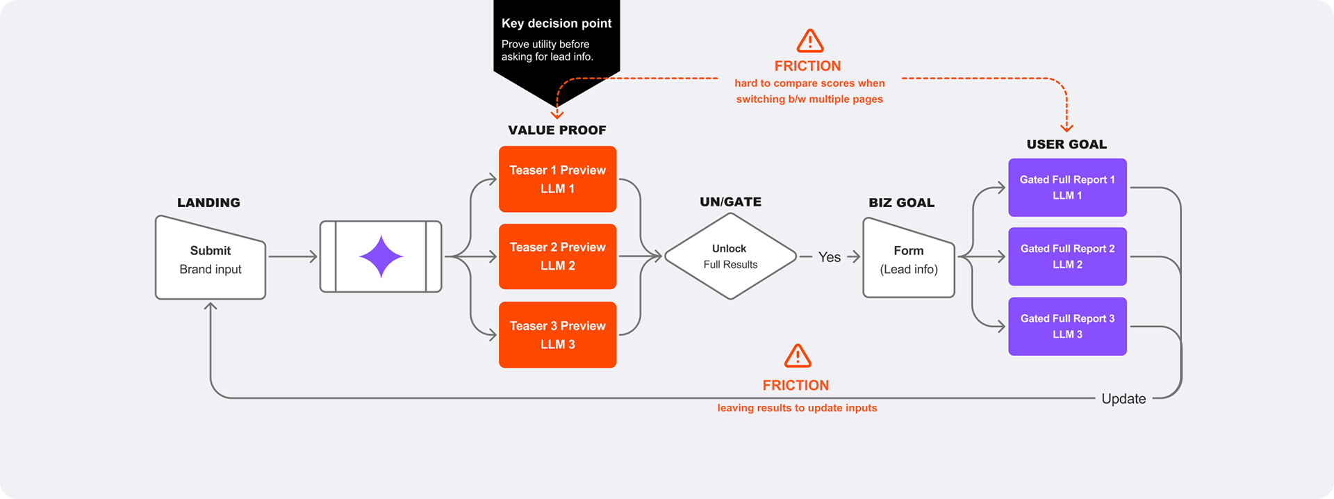
Legacy-to-mobile adaptation
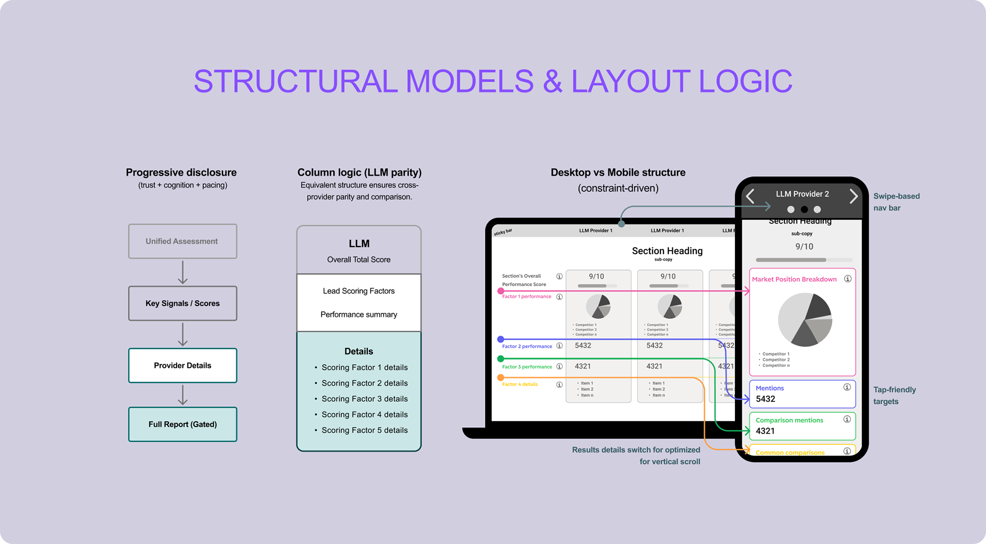
Existing desktop-first patterns had to be restructured into a performant, comparable mobile experience without losing clarity.
Trust and Explainability Challenge
➜ Users skeptical of "black box" algorithms and opaque AI scores.
➜ Risk of over-trusting automated insights.
➜ Needed transparent scoring and contextual explanations.
Solution Overview
Single-page flow optimized for time-to-value + trust + lead capture.
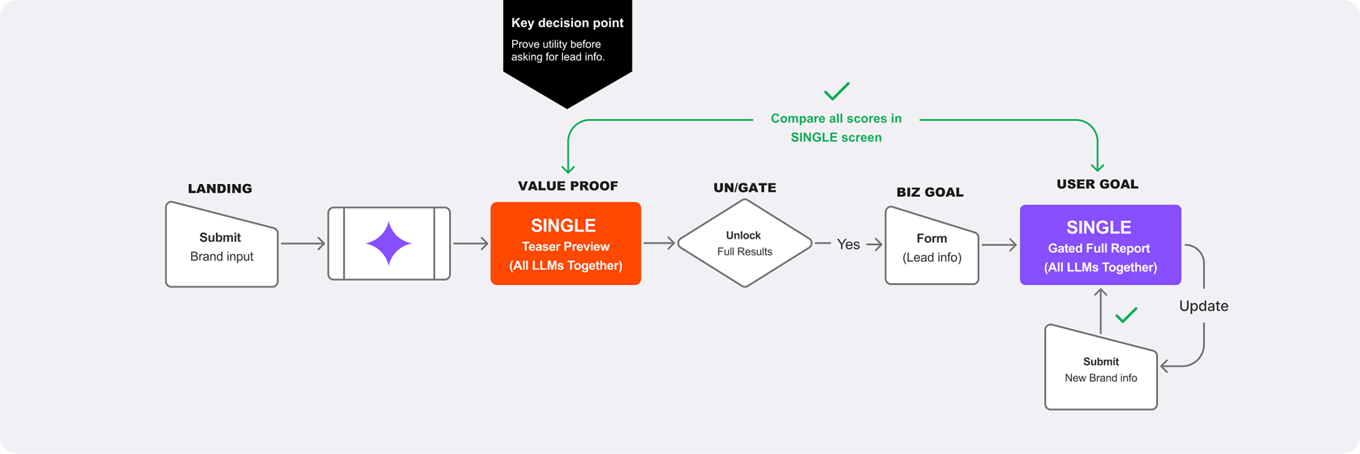
✔ Single page progressive disclosure experience accelerating time-to-value (mobile-first).
✔ Clear scoring + quick comparisons across LLMs, paired with next-step CTAs.
✔ Value-optimized teaser preview to demonstrate usefulness early.
✔ Share/Export results to enable follow-up engagement and reuse.
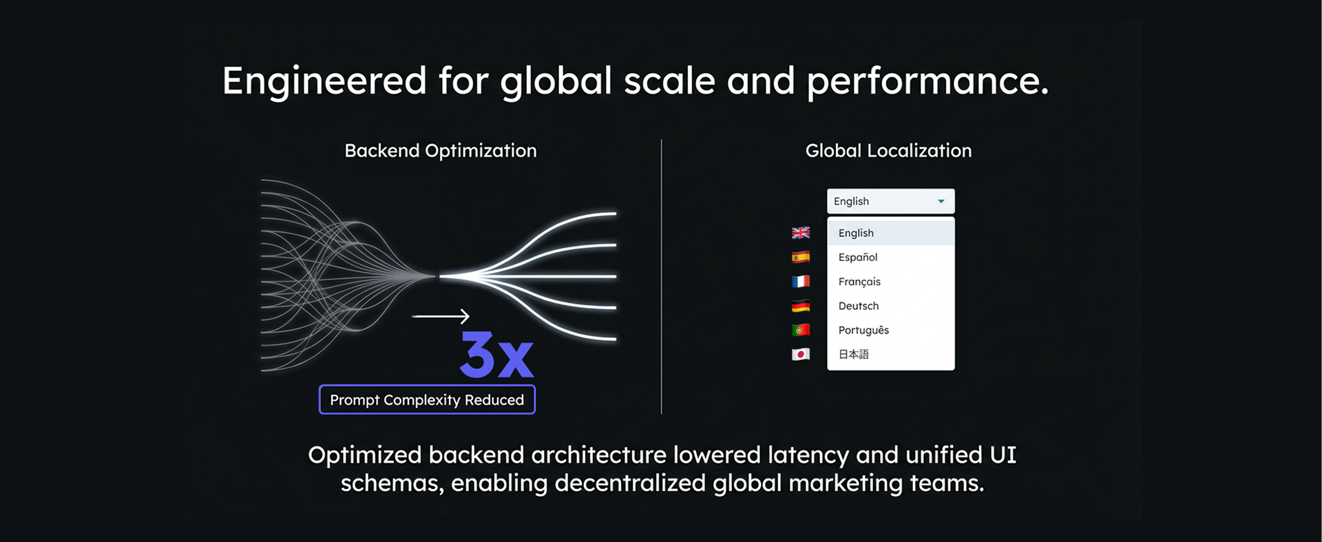
✔ Technical enabler: consolidated prompts - 3x less than legacy solution (lower latency + consistent schema for UI).
Key Design Decisions
1. Trust and Transparency
- Clear score breakdowns by dimension
- Transparent scoring + guiding explanations
- Tooltips + qualitative summaries for context
- Edit/update option (missing in legacy)
2. Mobile-First Usability
- Thumb-friendly targets
- Swipeable interaction patterns
3. Comparison and Parity
- Sticky comparison navigation
- Card-based layouts for scanability (swipeable on mobile)
4. Scalability and Robustness
- Localization selector (6 languages)
- Progress/completion states for delayed loading
- Improved data visualizations for complex, data-heavy examples
Outcomes & Impact
Design outcomes
✔ Improved transparency and comprehension of AI-generated results
✔ Higher completion rates for full reports
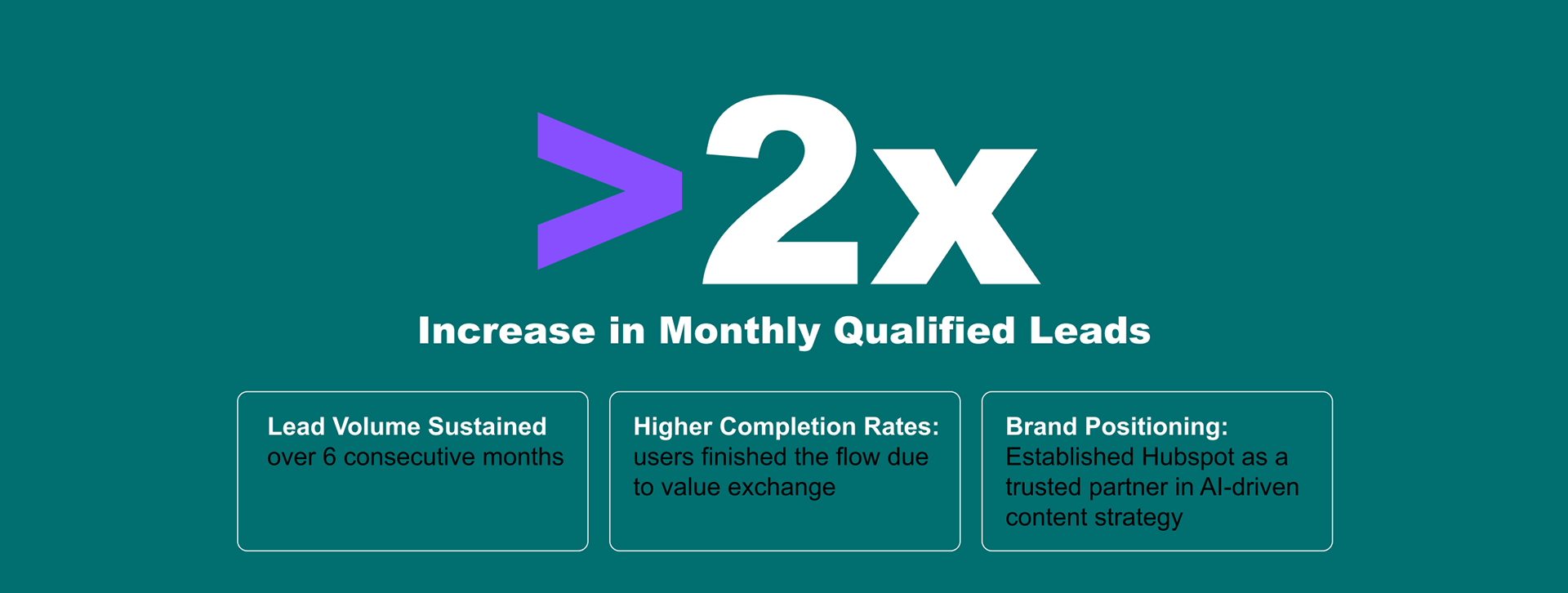
✔ Clearer positioning of HubSpot as a trusted partner in AI-driven content strategy
✔ Established a scalable product foundation supporting AI-driven demand generation
Business impact
✔ >2x increase of average monthly leads following AEO Grader redesign launch
✔ Lead volume sustained after over 6 consecutive months
Learnings
Explain AI decisions
When scores drive action, users need why not just what. Dimension breakdowns + tooltips + qualitative summaries made results feel legible (and reduced misinterpretation).
Design for trust
Trust is a product feature: transparency + “edit/update” controls and clear system feedback (progress/completion states) helped users stay confident during ambiguous or delayed moments.
Mobile behaviors reveal clarity gaps
Mobile forced the truth: thumb reach + swipe scanning + getting lost in comparisons exposed where clarity broke; sticky comparison nav + card-based layouts restored context and speed.
Prototype