TL;DR: Project Overview
HubSpot's developer ecosystem is a growth surface as a primary channel for acquiring engineers, app developers, and CMS developers. By 2019 it had grown into a patchwork of 10+ properties such as homepage, docs, changelog, open source, marketplace, app partner program, each with its own nav, design system, and tone. The cost showed up as soft signup volume and a falling NPS: net-new developers couldn't tell where to start, couldn't connect related concepts (API/App, CMS/website), and couldn't reliably find support.
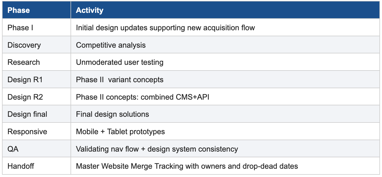
I led the UX for a two-phase redesign that expanded into a network-wide merger with unified navigation, design system adoption, and reorganized content. The work was framed end-to-end through a growth lens: every nav, section, and CTA decision was made to move a developer one step closer to a signed-up dev account. Phase I was validated through unmoderated qualitative user testing with several global developers, which drove the Phase II decisions.
Outcomes
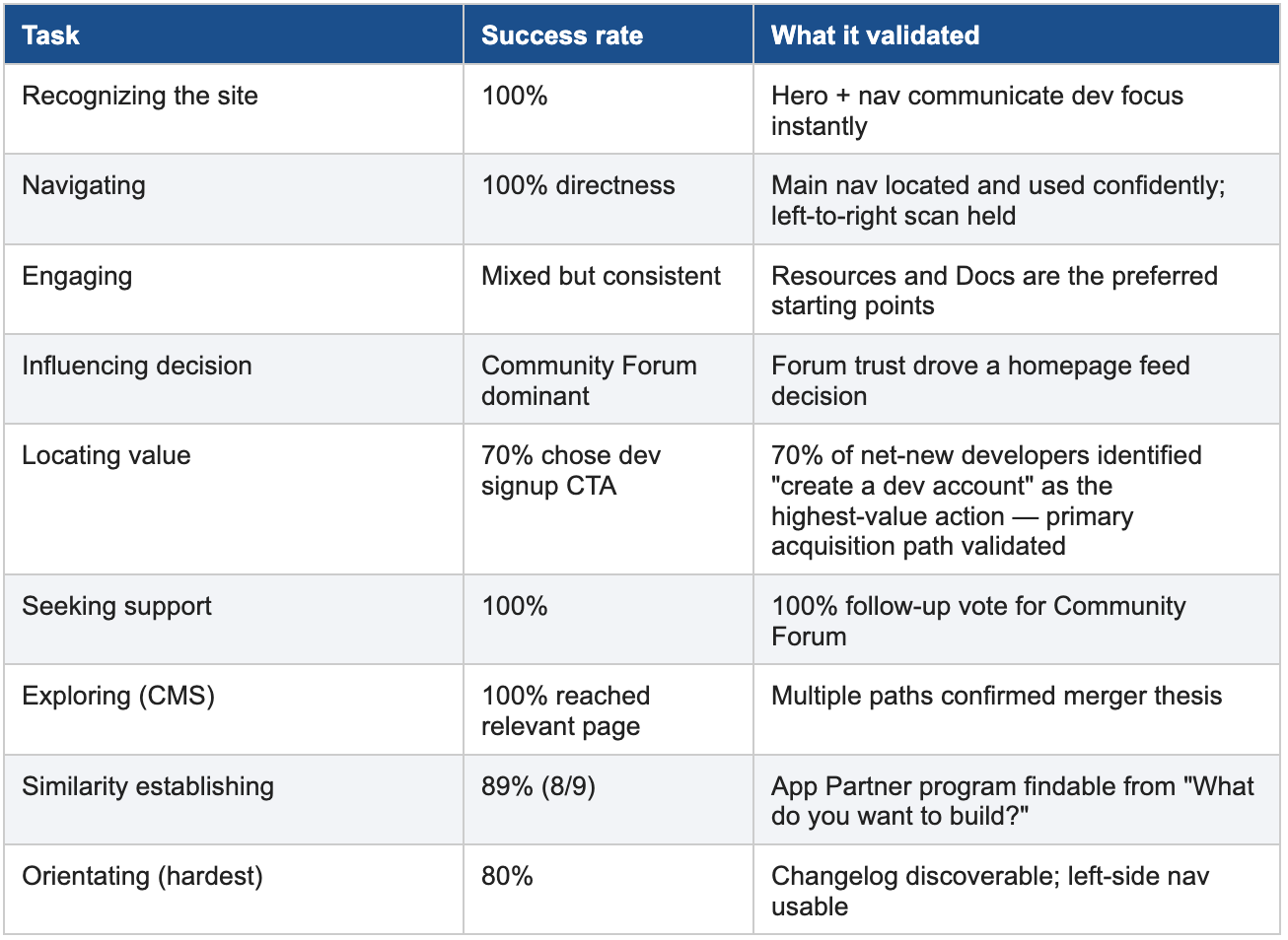
➜ 100% task success on Recognizing, Navigating, and Seeking Support tasks in user testing.
➜ 70% of respondents picked "create a developer account" as the single highest-value action, validating the primary conversion path.
➜ 100% of follow-up respondents named Developers Community Forum as their preferred support channel surfacing it from a buried sub-link to a first-class destination.
➜ 70% preferred a unified, technology-agnostic experience over separated tracks which drove the merger thesis.
➜ Single canonical main nav rolled out across the network; Styles consistent with the design system applied to Changelog, Open Source, App Partners, Code Gallery.
The Deep Dive
Unifying a Developer Ecosystem for Growth
Redesigning Developers.HubSpot.com into an acquisition surface for technical role audiences
Product-Led UX redesign unifying a developer ecosystem into a single acquisition surface for engineers, app developers, and CMS audiences that improves signup conversion and developer NPS through navigation consolidation and Design System adoption.
Role: Lead Product Designer
Company: HubSpot (2019 - 2020)
Scope: Product Design, UX Research, Design Strategy, Mobile UX, Data-Driven Personalization, Growth Marketing.
Partners: Engineering, Product Marketing, Web Strategy, CRO, SEO, QA
Duration: 9 months
Company: HubSpot (2019 - 2020)
Scope: Product Design, UX Research, Design Strategy, Mobile UX, Data-Driven Personalization, Growth Marketing.
Partners: Engineering, Product Marketing, Web Strategy, CRO, SEO, QA
Duration: 9 months

The Problem Space
HubSpot's developer audience is wide: app/integration developers using the APIs, CMS/website developers using the HubSpot CMS, designers building templates and modules, and business decision-makers evaluating whether to build on HubSpot at all. Over years of growth, each audience had accumulated its own destination — and its own design system, nav, and tone of voice.
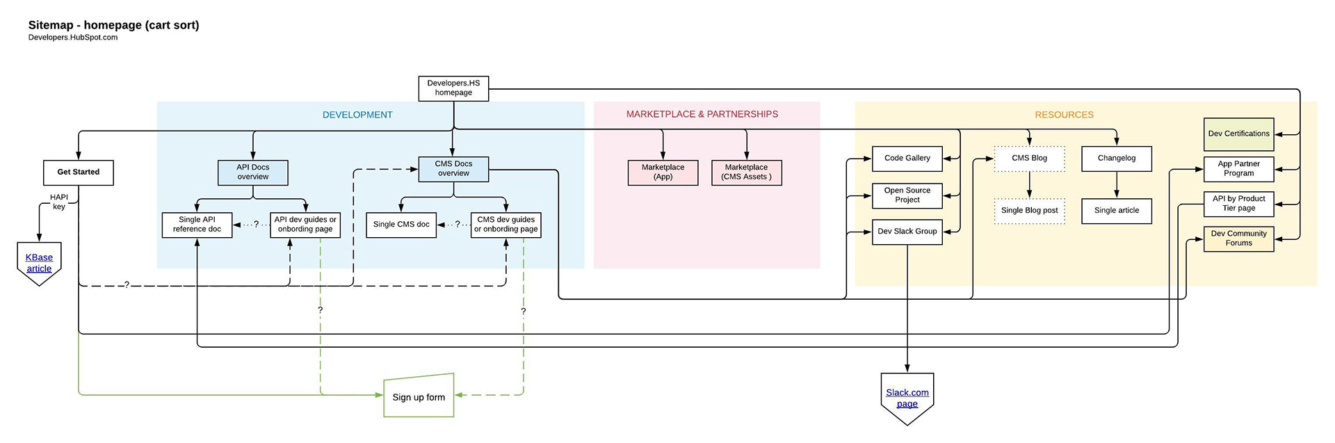
At the start of the project, a developer arriving at developers.hubspot.com had to traverse:
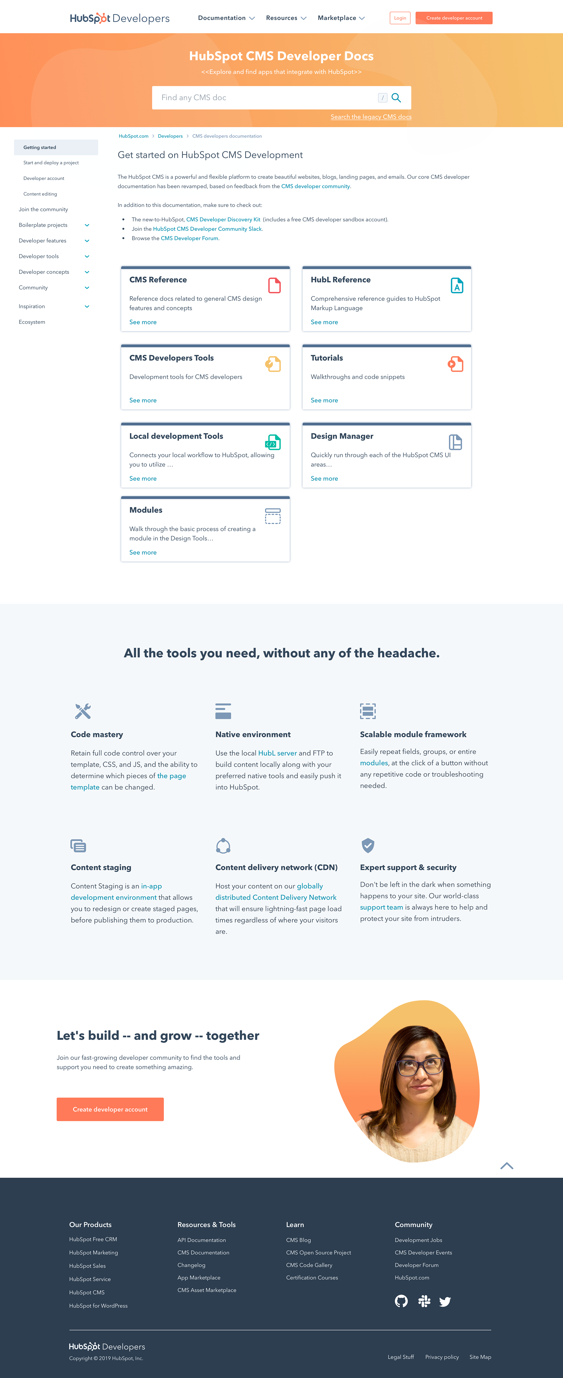
➜ developers.hubspot.com (homepage, getting started)
➜ designers.hubspot.com (parallel homepage for CMS/template developers)
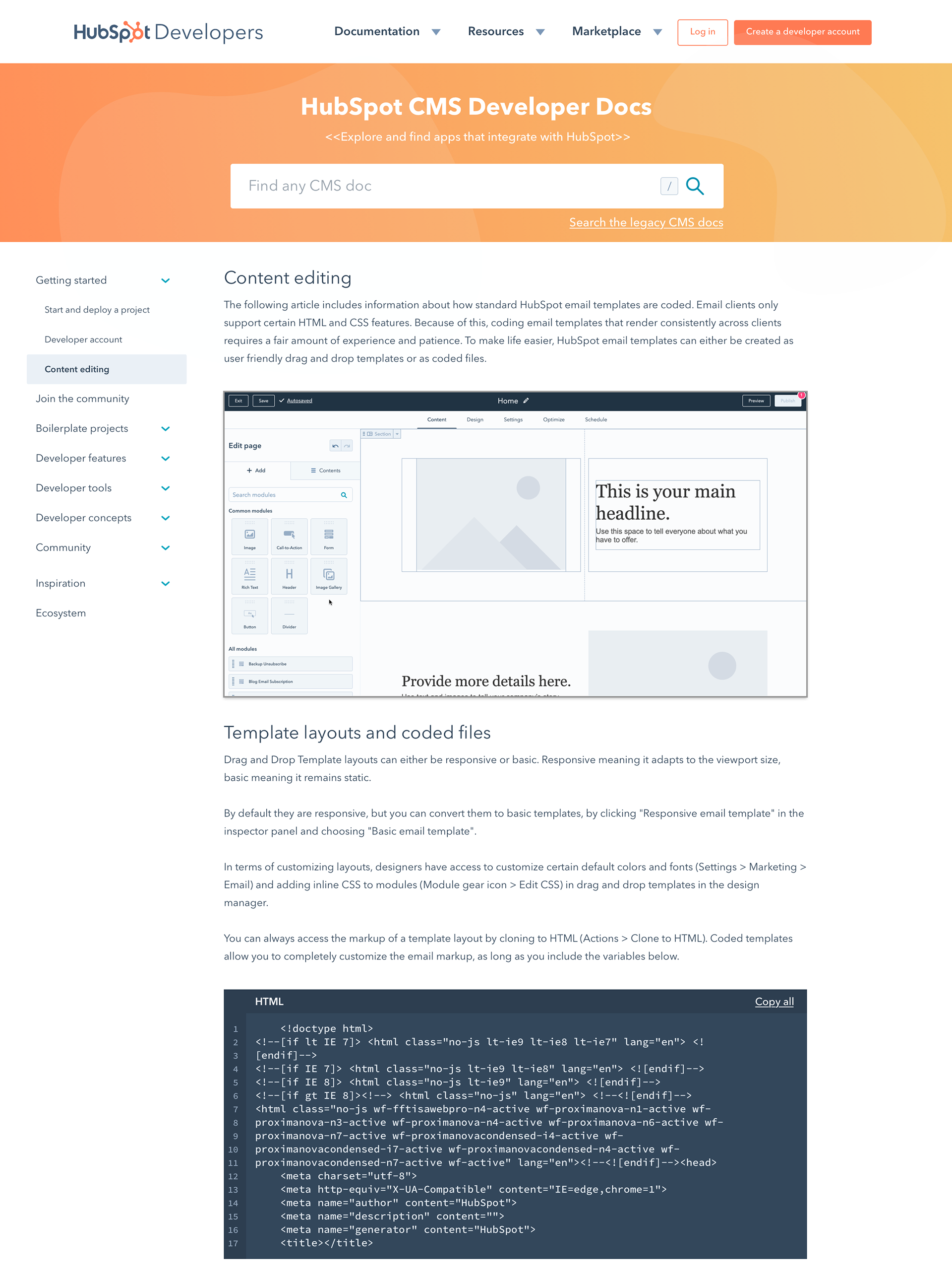
➜ Separate docs sites for CMS and API (different IA, different nav patterns)
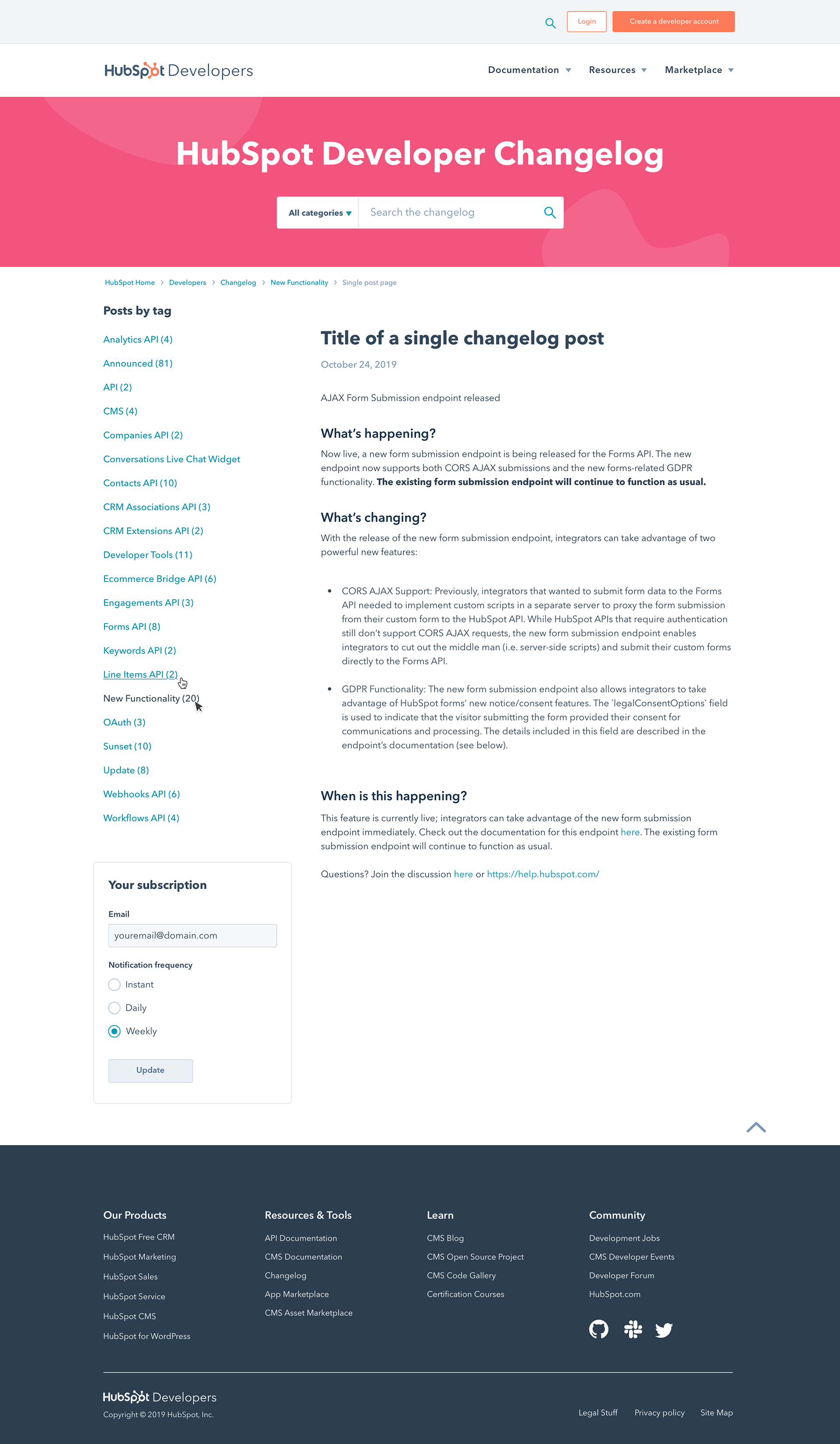
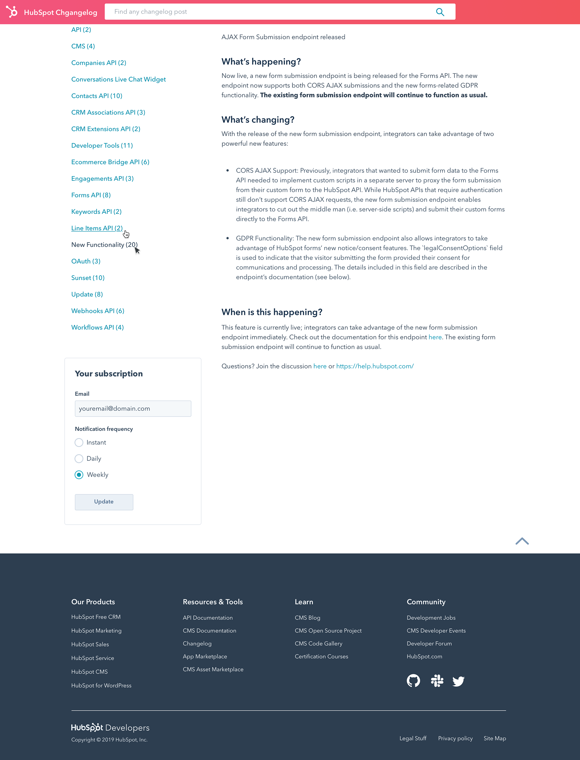
➜ Changelog (off-brand, Helvetica, ungrouped from Docs)
➜ Open Source Projects, Code Gallery (off-brand)
➜ Discovery Kit, Inspire, Dev Blog, App Marketplace, App Partner Program (varied design maturity)
Business Goals
Primary outcome: increase developer-account signup volume from a hard-to-acquire audience. Increasing CVR, improving NPS, applying the design system, and unifying the nav are the levers I used to get there.
➜ Increase conversion rate (CVR) to developer account signup.
➜ Improve Developers NPS.
➜ Bring all off-brand surfaces onto the design system.
➜ Introduce one canonical main navigation across the developer network.
➜ Merge Developers and Designers properties into a single coherent experience.
Why Growth is the business frame for this project
Developers are one of the hardest audiences to market to. They resist gated forms, ignore aspirational copy, and rely on peer validation. That makes the developer site itself the acquisition channel and not a downstream destination. Every UX decision in this project was made through a growth lens: can this nav, this section, this CTA move a developer one step closer to a signed-up dev account?
Framing the work this way also changed how we talked to stakeholders. Web Strategy and DevRel were aligned on UX outcomes (consistency, accessibility, brand) but each owned a different growth metric. The "growth surface" framing gave us one shared vocabulary across teams and one shared scoreboard for whether the redesign was working.
Role
I led the UX work end-to-end: discovery, research planning, solution exploration, prototyping for testing and stakeholder review, design system contribution, and design QA on implementation. I coordinated with Web Strategy (project leadership), DevRel (changelog, dev blog, CMS docs, API docs).
Research & Evidence
Method
After the initial Phase I, I ran an unmoderated qualitative usability test to validate the new design direction and uncover insights that would inform Phase II.
Findings
What worked
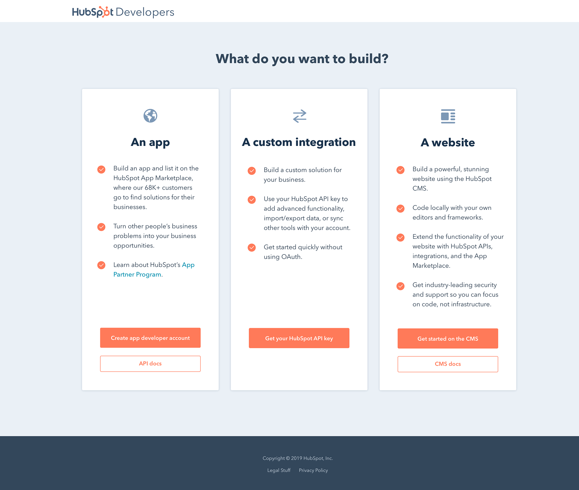
➜ 100% understood the developer focus of the new homepage immediately.
➜ Hero CTAs received 100% directness; "create a dev account" landed as the most valuable action.
➜ "What do you want to build?" persona-routing section validated as the strongest decision aid.
➜ Discovery Kit name attracted curiosity; the concept of a guided start was wanted.
➜ Left-side navigation in internal doc sites validated as intuitive and easy to scan.
What failed
➜ Bottom three home screen sections (timeline chart, testimonials/quotes, social-proof logos) were ignored by 80% of users.
➜ Users couldn't connect API ↔ App or CMS ↔ website without help.
➜ Different main navigations between dev and designer sites caused repeated confusion.
➜ Changelog's placement (and inconsistency with API Docs) caused 30% of users to confuse the two.
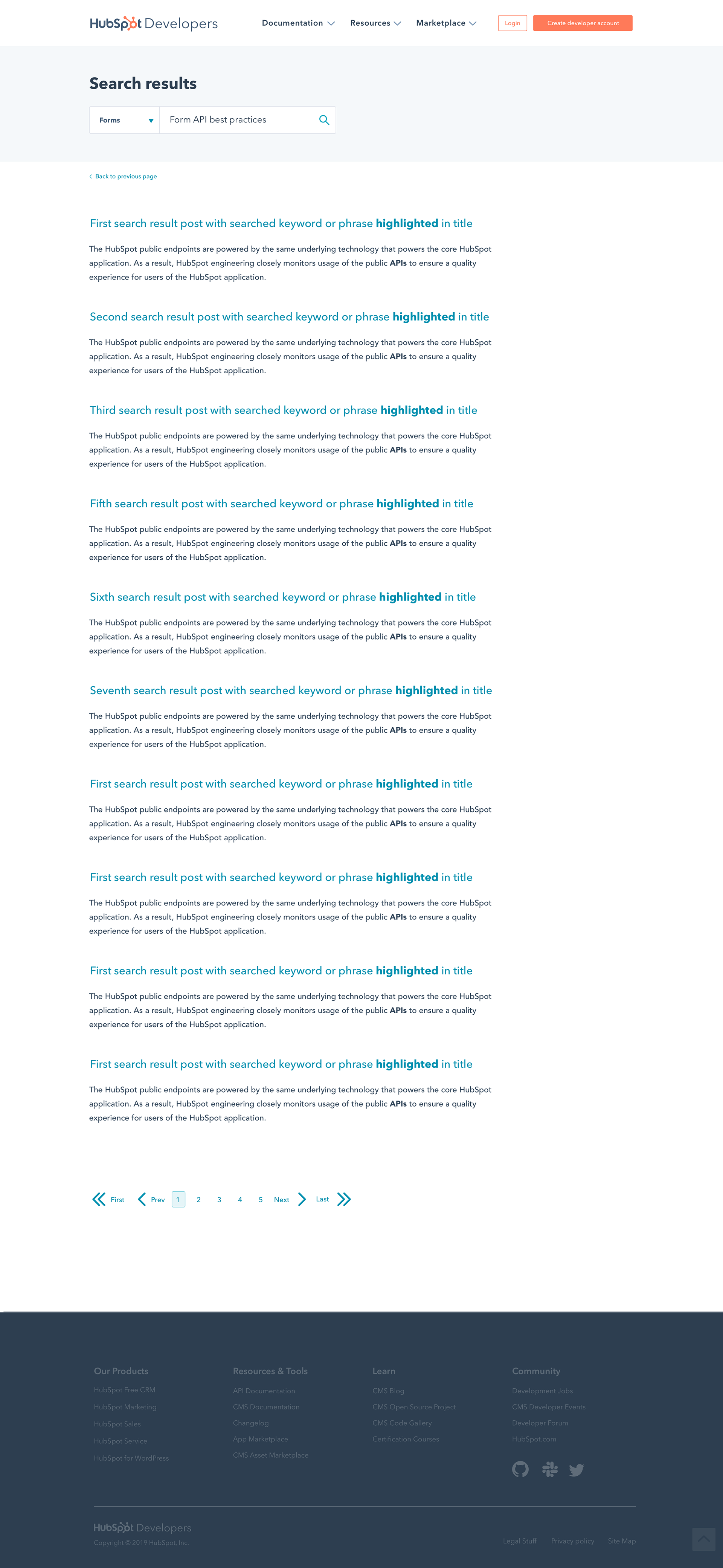
➜ Site search and chatbot were both repeatedly cited as missing.
➜ Discovery Kit page content didn't live up to its name.
Competitive scan
I studied several developer experiences with similar structural challenges: Screen captures and observations live in Discovery/Competitive analysis.
The key takeaway: every successful developer hub I looked at had
1. One canonical nav
2. One entry point that routed by intent rather than by product
3. A prominent, discoverable community/support surface.
Those three principles became the north star for Phase II.
Problems to Solve
Translating the research into a concrete problem statement, organized by category. Each problem maps to the evidence above and to a specific design decision in the next section.
Design Decisions
Each decision is paired with the problem it solved and the evidence that justified it.
Decision 1: One canonical main navigation
Problem: Different navs across properties broke the mental model.
Decision: A single global nav with Docs / Resources / Marketplace as primary categories, deployed to every developer/designer surface.
Tradeoff: Some teams owned their site's nav and resisted handing it over. We landed on a shared component with limited per-site customization (e.g., a contextual sub-nav within Docs).
Evidence: 100% directness on hero CTAs in Phase I validated the nav model; user expectations sharpened with each task (learnability).
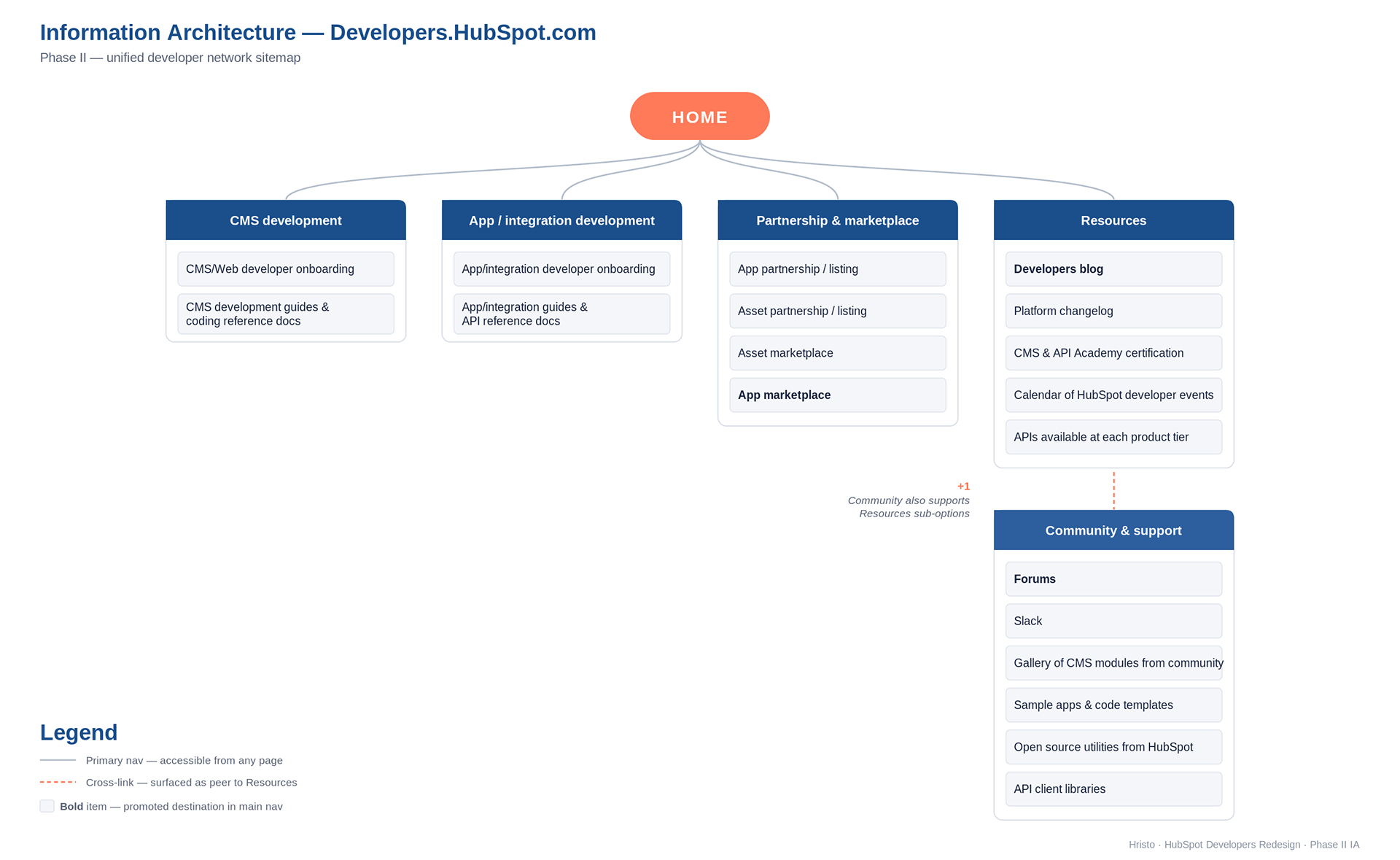
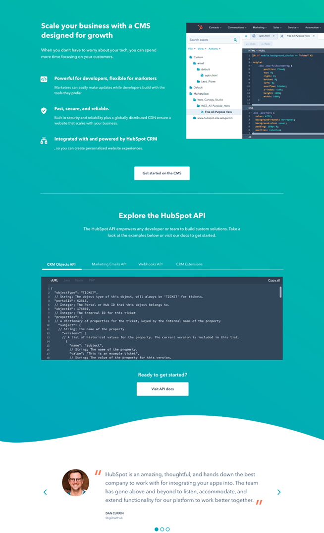
Decision 2: Combined CMS + API on one homepage
Problem: Two parallel homepages (Developers + Designers) confused new users; 70% preferred everything in one place.
Decision: Merge the home screens into one with a hybrid hero, and let the persona-routing "What do you want to build?" section split traffic into App, CMS, or Integration paths.
Tradeoff: Made the hero copy harder to write. It had to read clearly to both an API integrator and a CMS theme developer. We solved this by leading with a goal-oriented headline, not a tool-oriented one.
Decision 3: Promote Community Forum to a first-class destination
Problem: 100% follow-up vote for Forum as the preferred support source, but it was buried under Resources.
Decision: Add a Forum section to the home screen with a trending posts feed; surface Forum in both the main nav and the footer.
Tradeoff: The feed introduced content dependency (live data on the homepage). Worth it.
Decision 4: Reorder the homepage; replace dead sections
Problem: Bottom three sections ignored by 8/9 users.
Decision: Test swapping section 2 and 3; replace the timeline chart, quotes, and social-proof logos with a single interactive hybrid module that combines all three.
Tradeoff: Requested engineering to build a new module instead of three legacy ones which paid for itself in scroll depth.
Decision 5: Changelog elevated to Docs parity
Problem: Users confused Changelog with API Docs because of its sub-position.
Decision: Move Changelog to a sibling slot alongside API Docs and CMS Docs in the main nav; preserve the existing Changelog site IA (left-side nav, article cards, back-to-top) which had tested well.
Bonus: Re-used the Changelog site's emoji NPS slide-up as a network-wide pattern (validated as direct and friendly).
Decision 6: Systematically apply the design system
Problem: Off-brand surfaces broke brand trust and were measurably less engaging.
Decision: Roll the established design system into Changelog, Code Gallery, Open Source Projects, App Partners, App Marketplace, Inspire in that order of impact.
Tradeoff: Slower than re-skinning would have been; better long-term debt position.
Decision 7: Merge or remove overlapping pages
Problem: Designers homepage, Designer Docs homepage, and Discovery Kit shared too much content; users couldn't tell them apart.
Decision: Consolidate. Designers homepage retired into the unified Developers homepage. Discovery Kit kept as its own page but re-scoped as a "last step before signup" with stronger copy and a Slack signup as the final CTA.
Decision 8: Build search and prepare for chatbot
Problem: Site search and chatbot called out as missing in multiple tasks.
Decision: Designed a search results page and reserved a chatbot anchor in the footer area for the future integration.
Decision 9: Mobile and tablet treatment
Problem: Mobile users were out of scope for Phase I testing, but the responsive gap was visible.
Decision: Phase II shipped explicit mobile and tablet prototypes covering homepage, getting started, changelog, and open source project pages.
Pattern: Hamburger nav with prioritized footer for support/resources, plus a fixed bottom CTA bar on key conversion pages.
Process
Outcomes
Results relative to the primary business goal: increase developer-account signup volume. Task success rate validating the acquisition path.
Reflections
Three things became clearer to me on this project that I now use as defaults on similar work:
1. Persona-routing in the hero beats product-routing for ecosystems with multiple developer audiences. "What do you want to build?" outperformed every list of tools we tried.
2. A consolidated main nav is the highest-leverage UX investment in a multi-property site. It compounds across every other decision you make downstream.
3. Community is part of the product. Forum was treated as a support channel: it tested as a primary decision-making surface for net-new users evaluating whether to build at all.
Examples
Full screen comp