Project Overview
The Objective: Redesign the HubSpot Academy ecosystem to unify thousands of educational assets into a cohesive platform optimized for global scale and conversion.
The Challenge: Resolving "navigation sprawl" across multiple microsites and languages while simplifying the path from content discovery to certification.
Responsibility: Lead UX Designer; directed the design strategy, information architecture overhaul, intent-based content filtering and the integration of smarter categorization.
The Process: Implemented a unified navigation and modular interface, drastically shortening conversion paths and creating a consistent brand experience across diverse learning tracks.
The Impact: Established a frictionless, personalized discovery engine that accelerated time-to-certification and empowered a growing global community to discover relevant education faster.
The Deep Dive
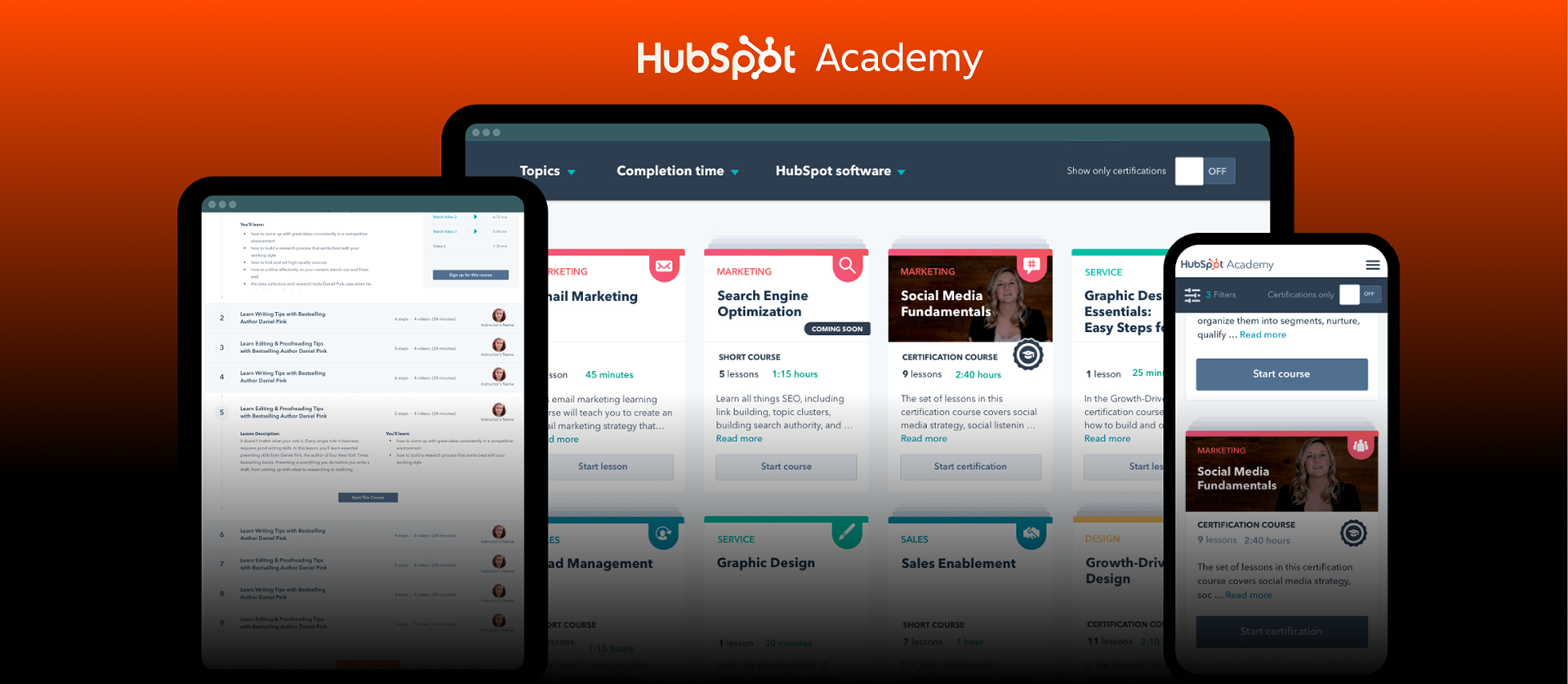
Redesigning HubSpot Academy for Scale & Conversion
Transforming an Education Platform from Lead Gen to User Acquisition.
An inside look at how we migrated to future-proof against privacy regulations, unify the user experience, and drive higher conversion rates.
Role: Lead Product Designer
Company: HubSpot (2018 - 2019)
Scope: Product Design, UX Research, Design Strategy, Mobile UX, Data-Driven Personalization, Growth Marketing.
Partners: Engineering, Product Marketing, Web Strategy, CRO, SEO, QA
Duration: 6 months
Company: HubSpot (2018 - 2019)
Scope: Product Design, UX Research, Design Strategy, Mobile UX, Data-Driven Personalization, Growth Marketing.
Partners: Engineering, Product Marketing, Web Strategy, CRO, SEO, QA
Duration: 6 months

The Context
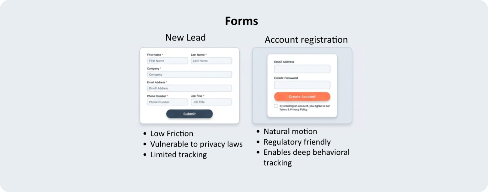
1. The Channel: Academy is a valuable acquisition engine, but relied on a legacy "Lead Gen" model.
2. The Catalyst: Privacy laws (GDPR) mandated a shift from Transactional Forms to Authenticated Accounts.
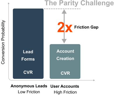
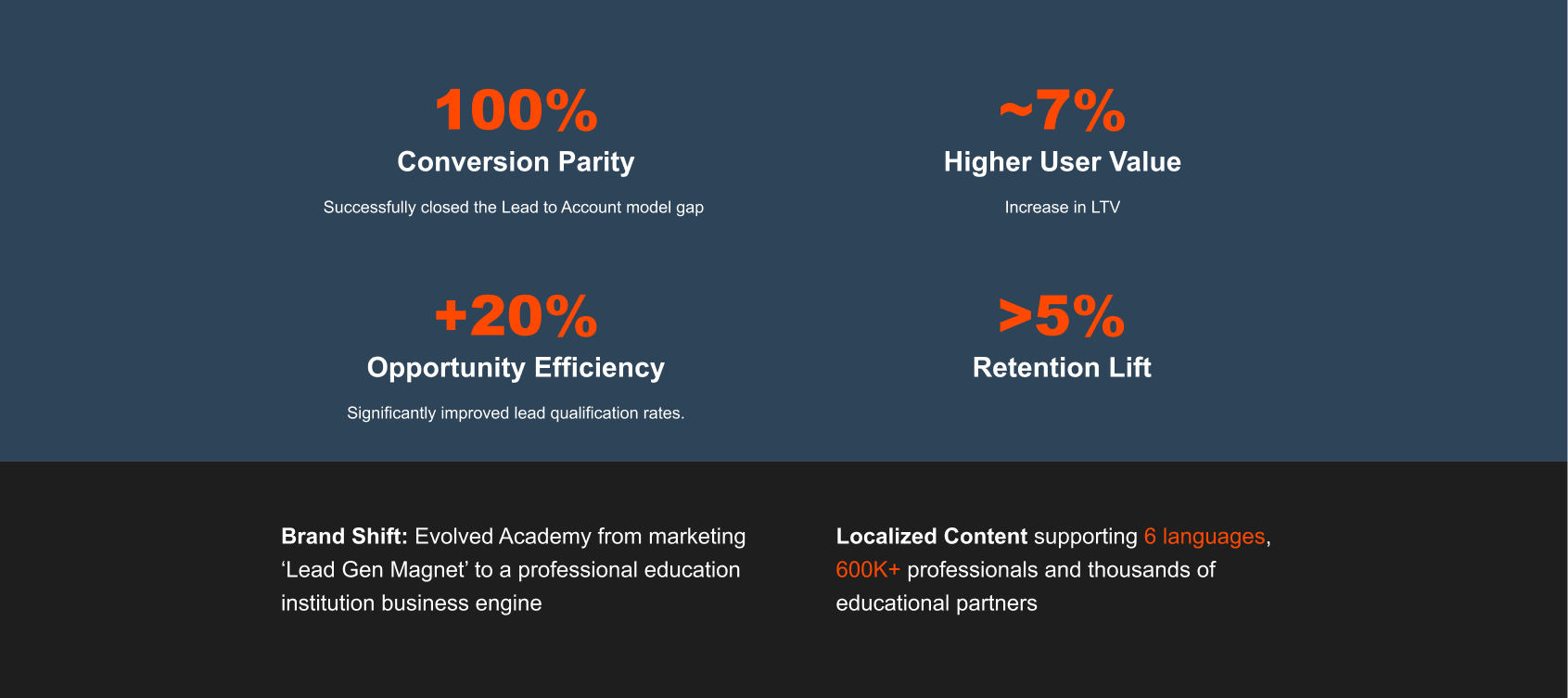
3. The Friction Gap: Account creation converts at ~50% the rate of simple Lead forms (The "Parity Challenge").
4. The Opportunity: Authenticated learners have higher LTV and Retention (>5% lift).
5. The UX Debt: Fragmented experience causing user disorientation.
The Business Problem
Newly introduced GDPR and new strict privacy laws compliance reduces Lead form CVR in Academy website

The User Problem
Design audit and user research uncovered:
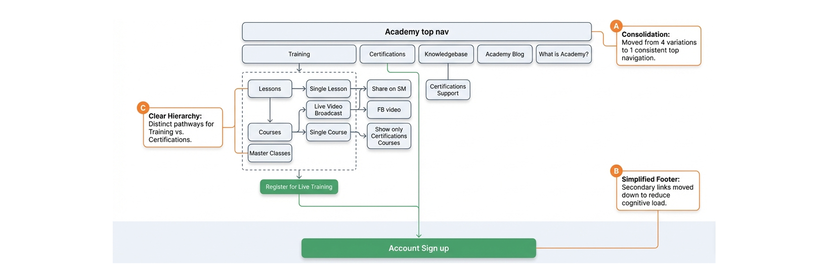
➜ Fragmented ecosystem: Orphaned pages, broken links, website existing in a silo.
➜ Inconsistent Navigation: 4 different navigations active simultaneously. Users repeatedly relied on the browser's 'Back' button because on-site navigation is unreliable.
➜ Value prop miss: Unclear to users that all content is 100% Free and online!
➜ Confusing Taxonomy: Poorly defined content hierarchy. Users cannot distinguish between a Lesson, a Course, and a Certification defined ambiguous content hierarchy.
Insight: Users demand immediate value.
The Strategic Pivot
The Business case: From 'Leads' to 'Accounts'
Business Shift
Moving from ‘Legitimate Interest’ to ‘Explicit Consent’ to future proof against GDPR.
Switching to Account Registration model creates a natural account creation motion that regulators prefer over form-gating.

Insight: To maintain and increase growth, we must change our playbook turning the demand we generate for content into accounts instead of leads."
The Objectives
➜ Maintain conversion parity
➜ Unify the Lead-based and Account creation models into a single seamless system.
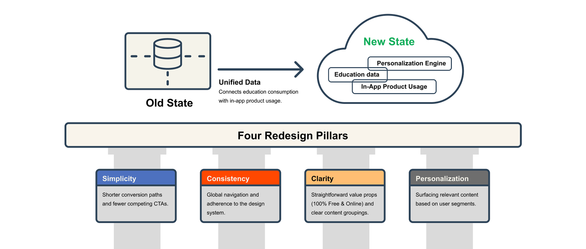
➜ Migrate >500K users for personalization and centralized data
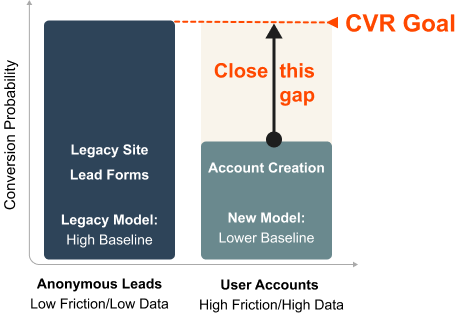
Business Goal:
Maintain volume while increasing user commitment
UX Goal:
Close the gap through value clarity and reduced cognitive load.
The Opportunity
Bringing the Account creation CVR to parity with the Lead funnel would generate additional revenue.
The Challenge
➜ Account creation introduces high friction
➜ Pivot from low-friction Transactional Lead Gen (gated content) acquisition model to Product-Led User Acquisition (authenticated accounts), capturing higher-intent users at the very first touchpoint.
Insight: Asking a user to create an account is harder than asking for an email. We had to bridge this gap without destroying lead volume.
The Strategy
Research & Analysis
Research Finding 1: Users demanded autonomy, not just recommendations.
The Heatmap Revelation: Analysis showed that the "View all courses" link was highly engaged with, despite being buried in the visual hierarchy.
Assumption: Users need hand-picked "New & Noteworthy" suggestions. \
Evidence: Heatmaps proved users ignored curation. They treated the Academy as a utility library, heading straight for the 'View All' directory.
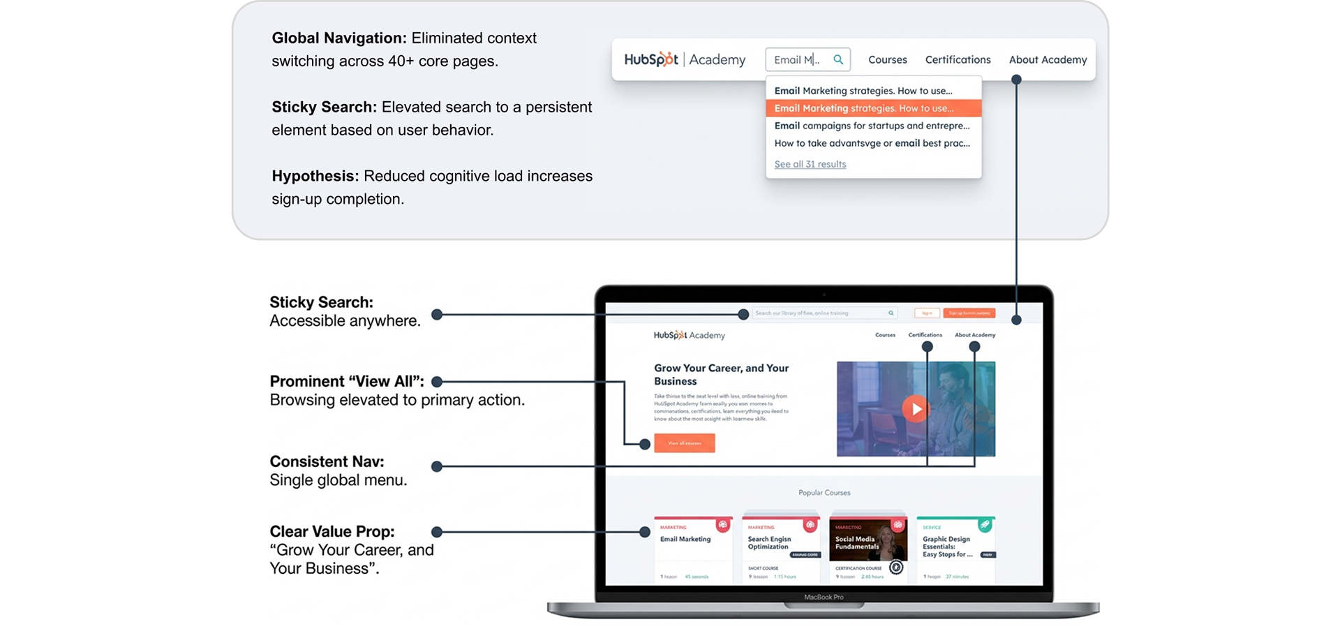
Design Action: Simplified hero section to reduce clicks-to-content.

Design Response: We restructured the hierarchy to prioritize the Full Library view and built robust filtering (Topic, Time, Software) to support autonomous discovery.
The ‘Say - Do’ Gap
Research Finding 2: Users asked for more context but in reality they proffered the quick involvement instead
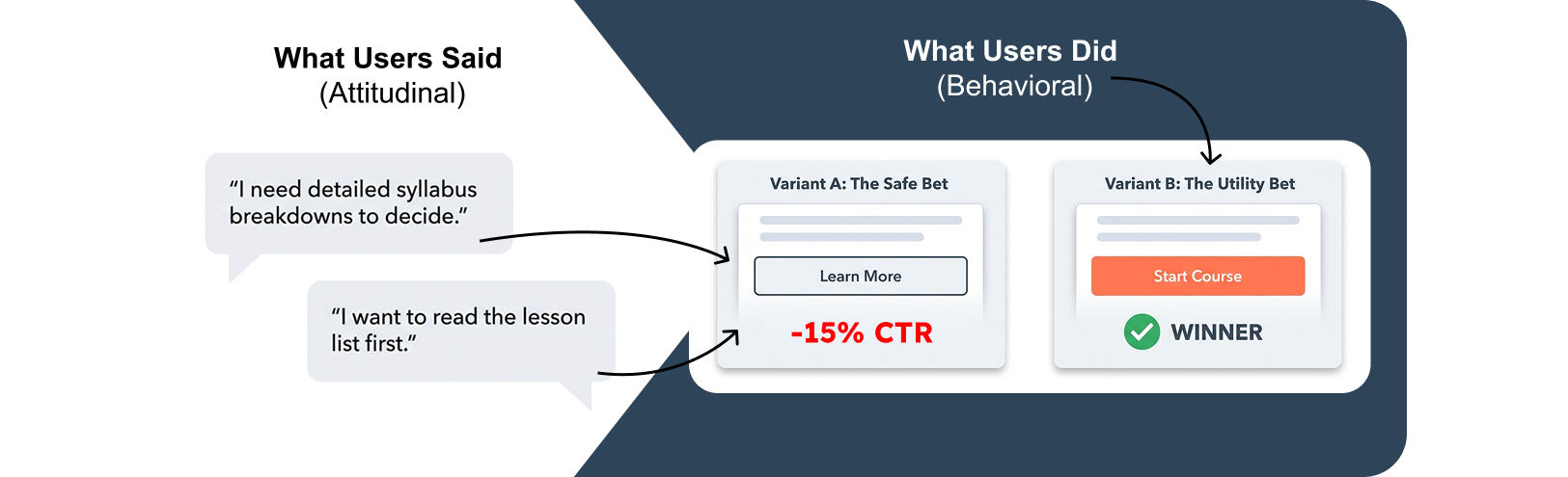
Insight: Qualitative research favored the softer "Learn More" approach. However, real world testing revealed a massive drop in engagement where data proved a fast, transactional decision process.
Evolving the Aesthetic for Trust
Research Finding 3: Preference tests validated the design direction for utilizing the global design system
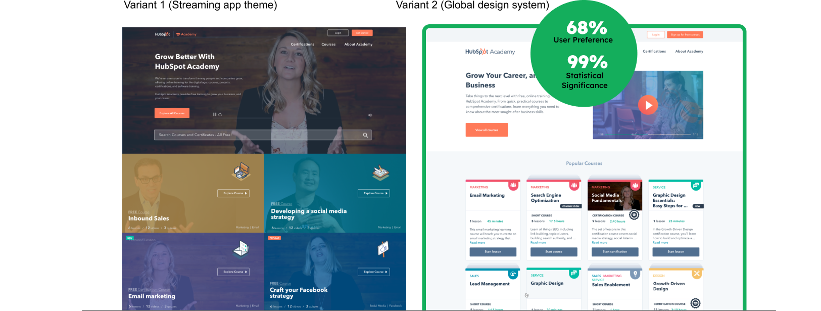
Insight: To ask users for personal data (Account Creation), we needed to shift the brand perception from a "game" to a "professional credential". Trust was the priority.
Design Solutions
Design Solution 1
Consolidated architecture
Design Solution 2
Unified Conversion-Centric UI
Design Solution 3
Enhanced Discovery & Filtering
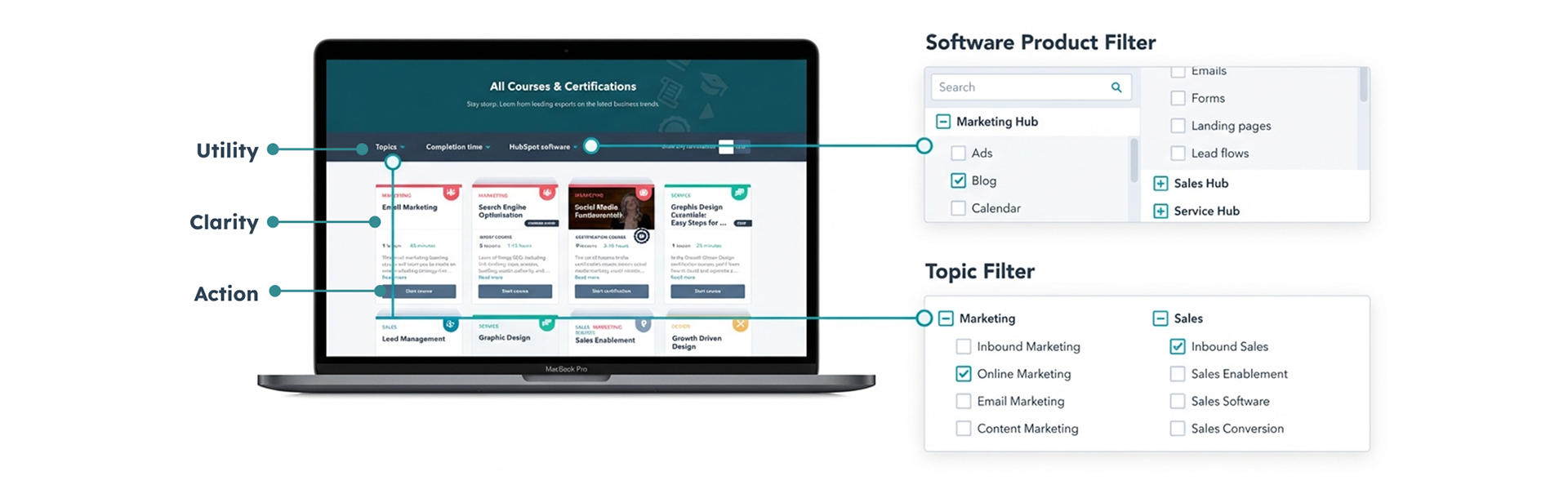
UX Goal: Enable users to proactively find education based on specific needs (Topic, Time, Software) with clear result cards.
Design Solution 4
Improved Content Model
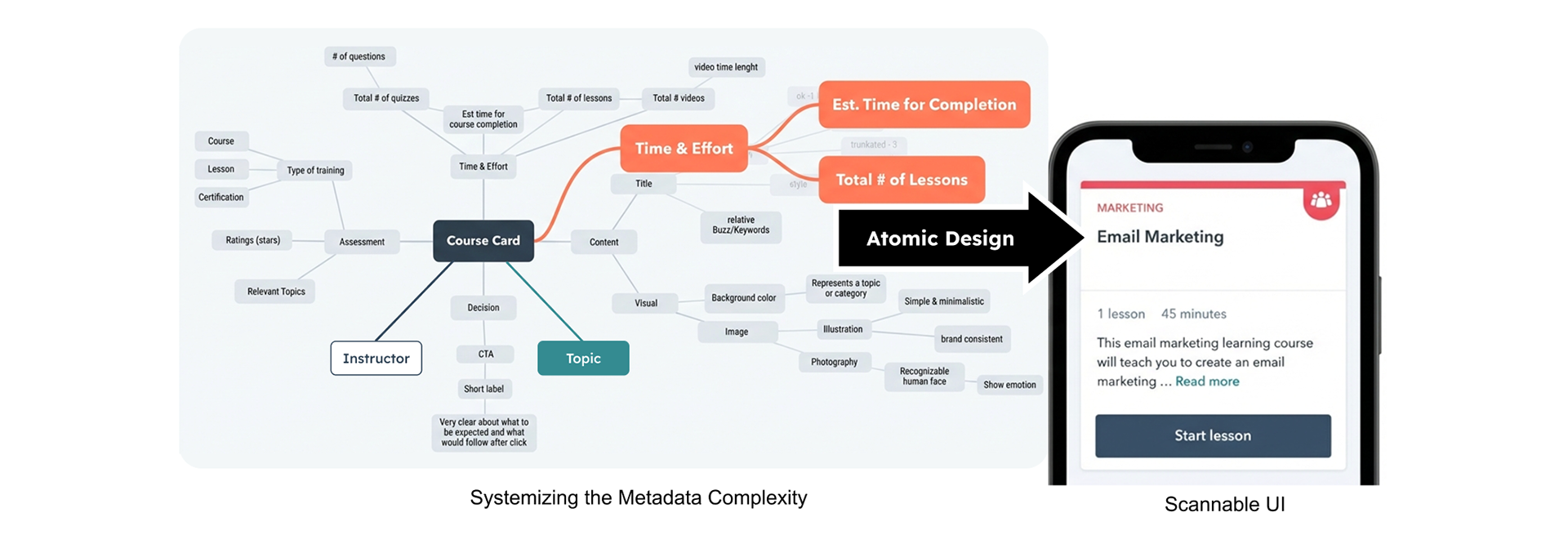
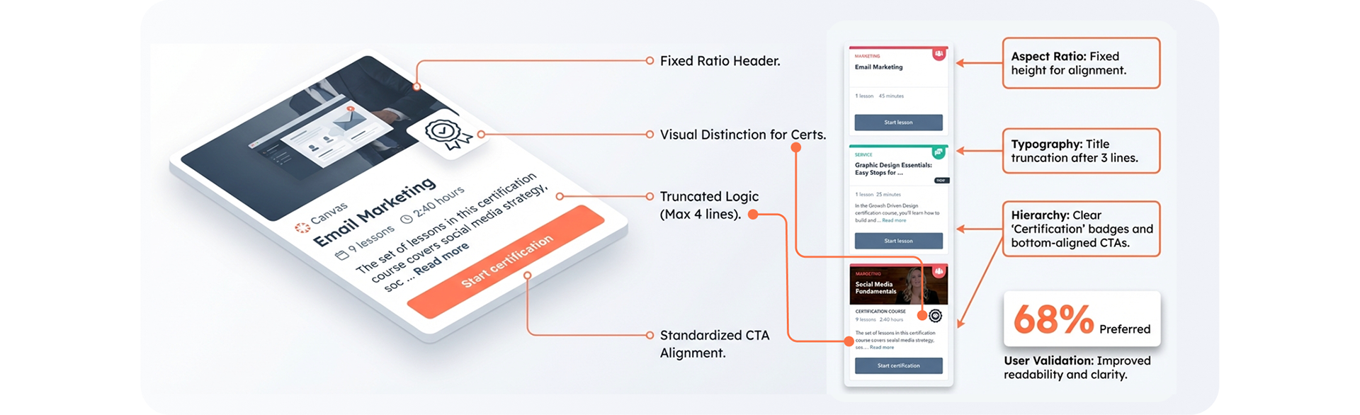
Mapping the Course Card
Standardized Card Architecture
Design Solution 5
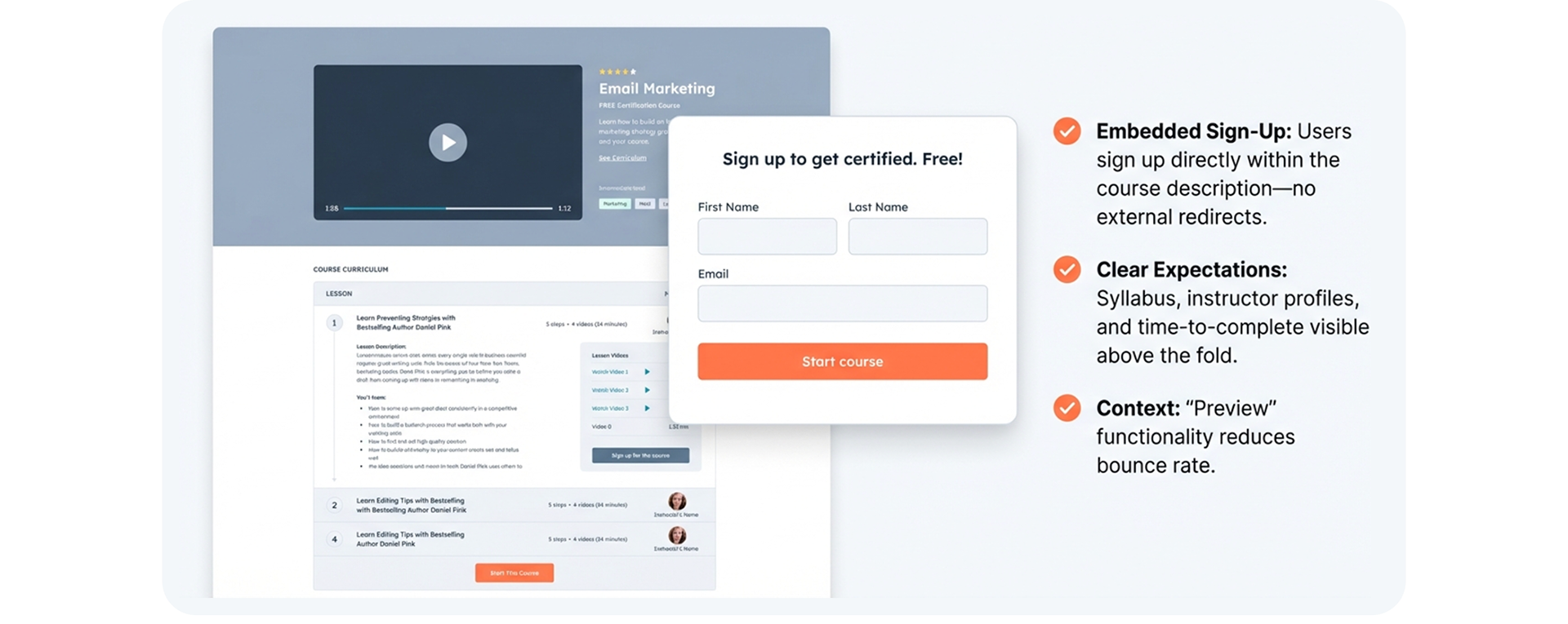
Details/Landing page
Frictionless entry points turn visitors into learners instantly.
Design Solution 6
Solving the Value Proposition Gap
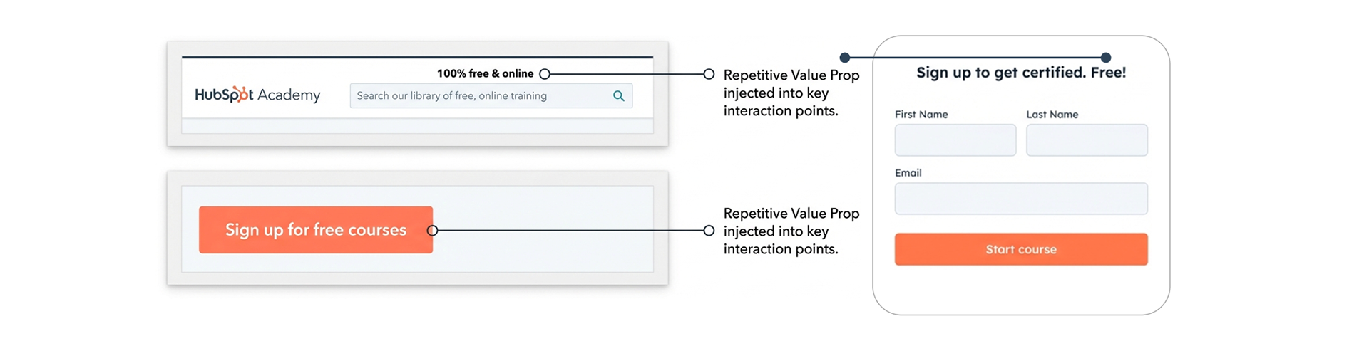
Insight: Users didn't believe it was free. We had to be louder.
Design Solution 7
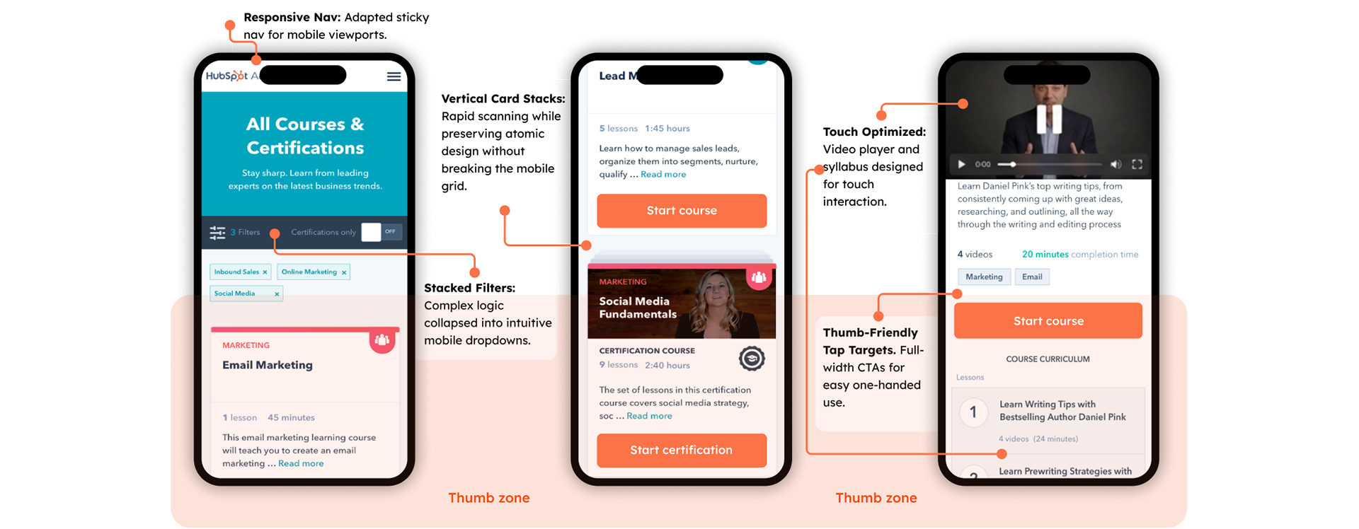
Responsive Experience: Optimizing for the Thumb Zone and Rapid Scanning
Outcomes
We successfully pivoted from Transactional Lead Gen to Product-Led User Acquisition, migrating 500K+ users to an authenticated model without losing volume. By bridging the 'Friction Gap,' this project proved that strategic design drives tangible business value.
Takeaways
Principal Learning: Behavioral > Attitudinal
The syllabus paradox proved that users are poor predictors of their own behavior.
Future strategy: Prioritize behavioral validation (A/B testing) over attitudinal validation (interviews) for conversion-critical decisions. Always verify qualitative feedback with quantitative testing.
Value Prop Blindness
Users often missed that Academy was free. "Free Certification" must be explicit to reduce hesitation.
Search is Primary
For educational content, search is not a utility; it is the primary navigation method and a Tier 1 design element..