
Role: Lead UX Designer
Scope: Growth, Sales Enablement, Data Visualization
Partners: Product Marketing, Engineering, QA, Web Strategy
Duration: 3 months
Led the experience strategy for a unified ROI engine that transformed a high-friction form into a "Zero-Input" value demonstrator, driving leads and sales adoption across global markets.
Context & Constraints (Why this was hard)
Purpose: Modernize a legacy tool to drive high-quality leads and sign-ups.
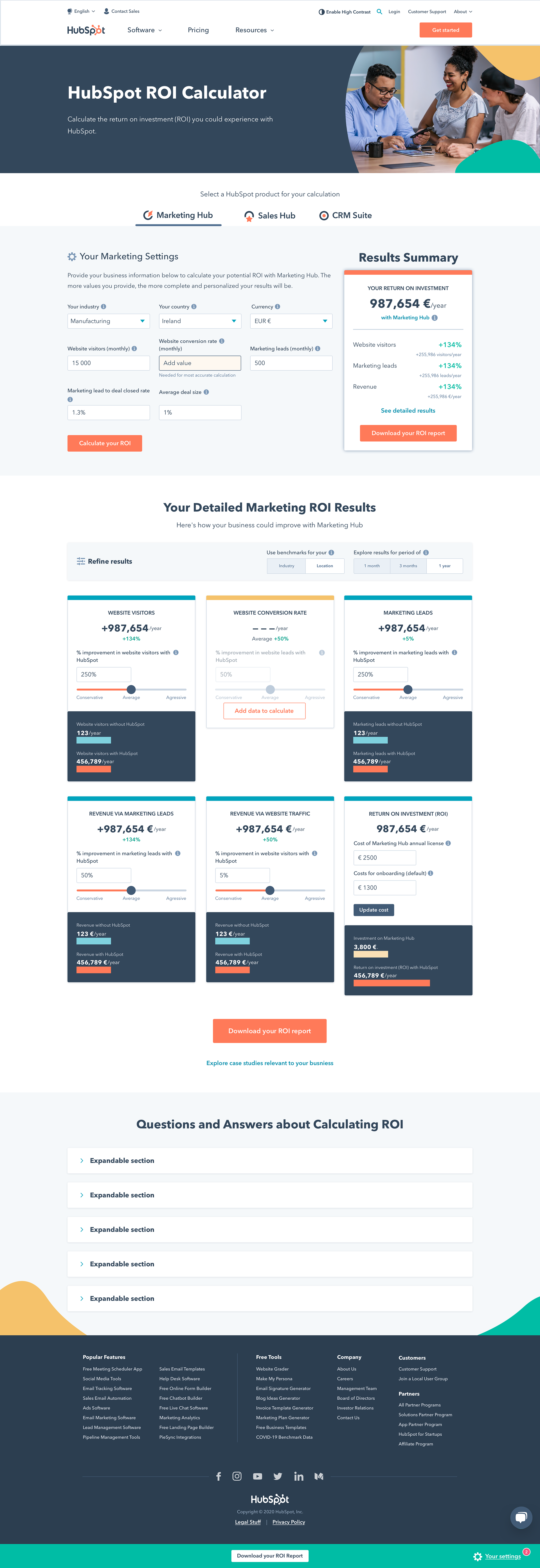
• The "Blank Page" Friction: The previous tool required 8+ distinct inputs before showing any value, causing high abandonment rates among users who lacked specific data.
• Dual-Persona Complexity: The solution had to serve two distinct users simultaneously: the Website Visitor (self-serve exploration) and the Sales Rep (consultative demo tool).
• Global Scalability: The design needed to support 6 languages and local currencies immediately, while sharing a single React codebase across three product lines (Marketing, Sales, CRM) to minimize technical debt.
• Authentication Constraints: Unlike internal tools, this had to be purely public-facing with no user authentication, limiting our ability to pull existing customer data.
The Problem Framed
We needed to transform the ROI calculator from a "data entry task" into a "persuasion engine" that was:
• Instantaneous: Capable of delivering a credible ROI estimate without a single keystroke from the user ("Zero-Input").
• Persuasive: Structured to create transparency and trust, motivating users to sign up rather than just delivering a number.
• Executive-Ready: The output needed to survive the browser session, arming internal champions (our 3rd persona) with a "boss-ready" PDF artifact to influence buying committees.
Role & Ownership
• Led the end-to-end design effort, cross-collaborating with Product Marketing, PM, Engineering, and Web Strategy.
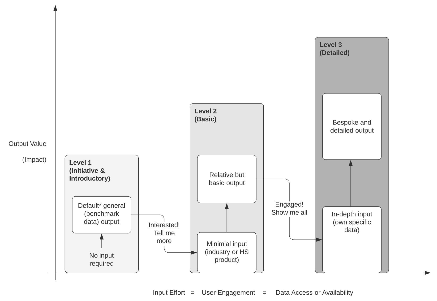
• Partnered with Data & Tools (Tammy) to translate 238,000+ data points into a simplified "Initiative" vs. "Detailed" engagement model.
• Influenced the engineering approach by advocating for a unified template strategy, which allowed the "CRM Suite" and "Sales Hub" calculators to live within the same architecture.
• Did not own the backend calculation formulas or the initial aggregation of the benchmark data.
Strategy & Approach
Key Decision 1: "Zero-Input" Strategy via GeoIP
• The Option: Wait for users to input region/industry (standard flow) vs. Automate it.
• The Decision: I implemented a "Level 1" engagement state that uses GeoIP to detect the user's region and pre-select the appropriate currency and benchmarks.
• Why: This removed the "cold start" problem. A user landing on the page immediately sees relevant ROI projections, shifting the interaction from "Work" (filling forms) to "Play" (adjusting sliders).
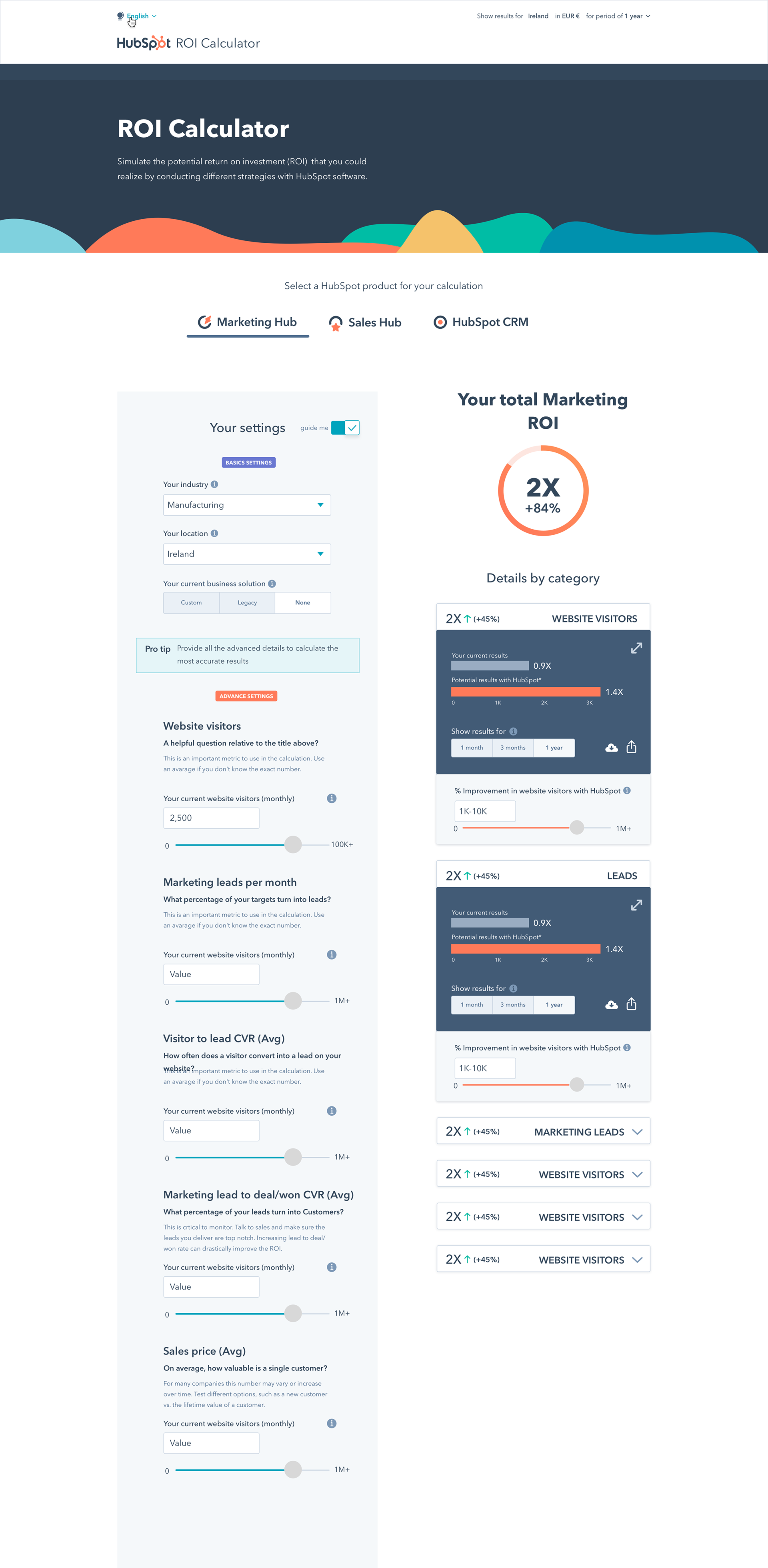
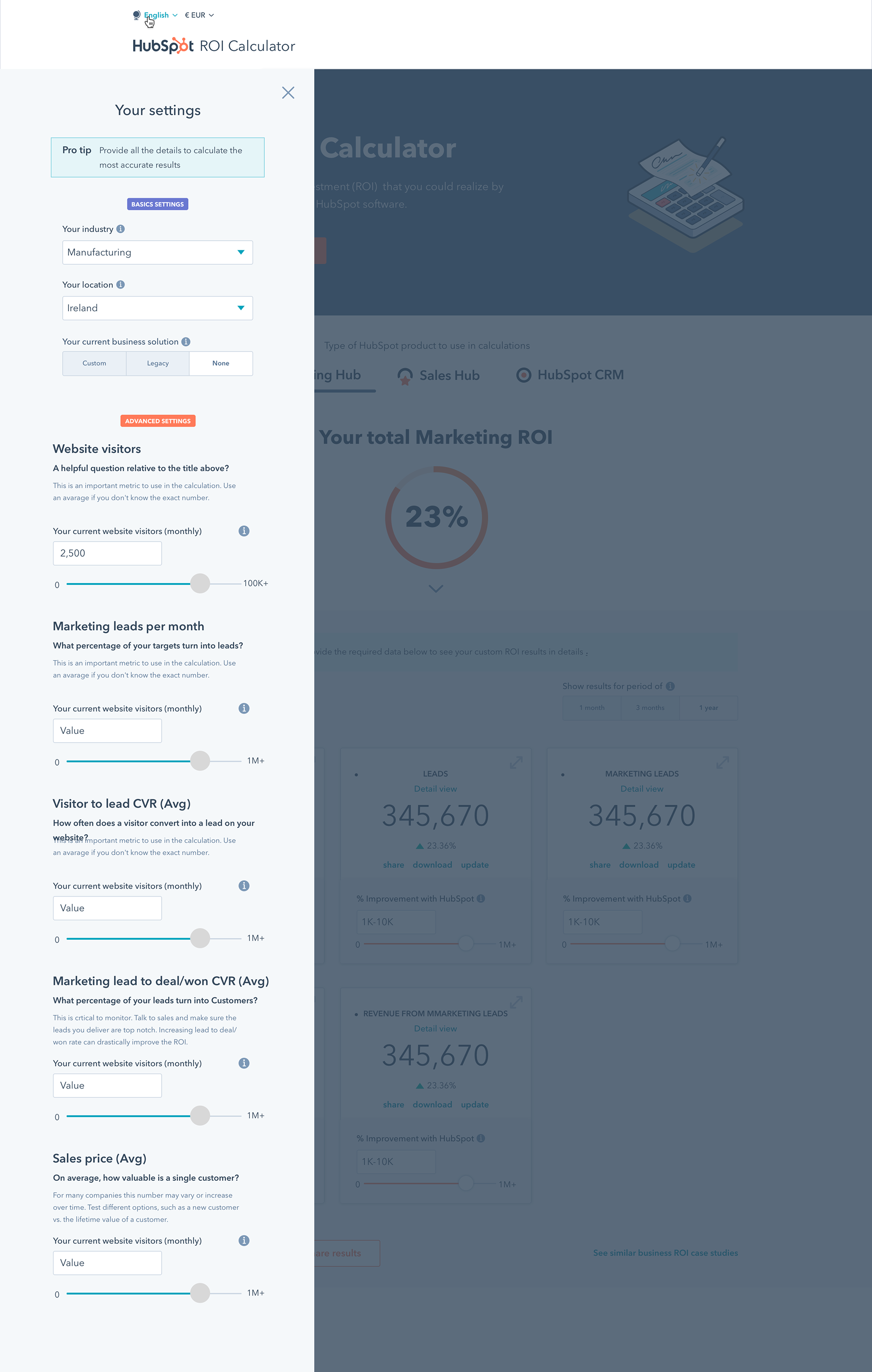
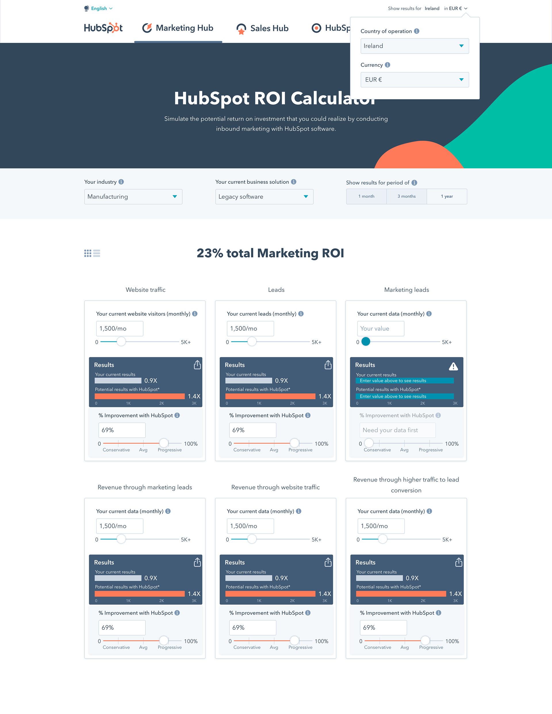
Key Decision 2: The "Hybrid" Layout (Merging Prototypes)
• The Conflict: User testing showed a split preference: Prototype 2 had a superior summary header, but Prototype 3 offered better visibility of inputs.
• The Decision: I rejected choosing a "winner" and instead designed a Hybrid Model. We kept the high-level summary "Sticky Header" (from Proto 2) while keeping input fields exposed (from Proto 3) rather than hiding them in a drawer.
• Why: Users described this as the "sweet spot" for information density—sales reps could pitch the summary, while skeptics could audit the inputs.
Key Decision 3: Variable Interaction Patterns (Precision vs. Speed)
• The Conflict: The desire for a "fancy," all-slider UI vs. data accuracy.
• The Decision: We used Text Fields for volume inputs (e.g., "1,000 vs 1,000,000 visitors") and Sliders for "Confidence" (% improvement).
• Why: Sliders failed for massive ranges during testing. Restricting sliders to the "Conservative vs. Aggressive" variable allowed users to intuitively "weight" the risk without sacrificing the precision of their financial inputs.
Design Artifacts (Show only what proves thinking)
• "Levels of Engagement" Model: A strategic diagram mapping User Effort to Value (Level 1: Initiative → Level 2: Basic → Level 3: Detailed), which aligned the dev team on the progressive disclosure logic.
• Prototype Evolution: Comparative visuals of the "Side-by-Side" vs. "Hidden Sidebar" concepts, documenting the move to the final "Hybrid" layout.
• The "Executive" PDF: A specific artifact designed for the "3rd Persona" (the Decision Maker), focusing on clear visualizations that could stand alone in a boardroom.
Outcomes & Impact
• Business Impact: The tool successfully increased new leads and sign-ups, becoming a primary driver for the "Growth" objective.
• User Adoption: Solved the "Blank Page" abandonment issue; Sales Reps adopted the tool for live demos because they could show value instantly using benchmarks.
• Team Velocity: The thorough "Discovery" and "Formula Definition" phases meant the development scope didn't change during the build, leading to high team morale and productive pair-programming sprints.
Learnings / What I’d Do Differently
• Advocate for Integrated QA: We relied on a third-party vendor (Scleraworx) which proved "ineffective." I would now insist on embedding QA testers into our sprints from Day 1 to catch logic errors early.
• Unify Naming Conventions: We lost velocity due to confusion between design file names and code components. I would establish a shared taxonomy/glossary during the handoff phase.
• Validate "Share" Earlier: We discovered late that 18/20 users prioritized the "Download" button. I would have elevated this feature in the hierarchy sooner.
What This Project Demonstrates
• Systems Thinking: Building a scalable engine that serves multiple product lines and languages from a single source of truth.
• Commercial Fluency: Designing for multiple buying personas (User vs. Buyer) to drive tangible business metrics (Leads).
• Data-Driven UX: Successfully translating complex statistical constraints (238k data points) into a simple, consumer-grade interface.